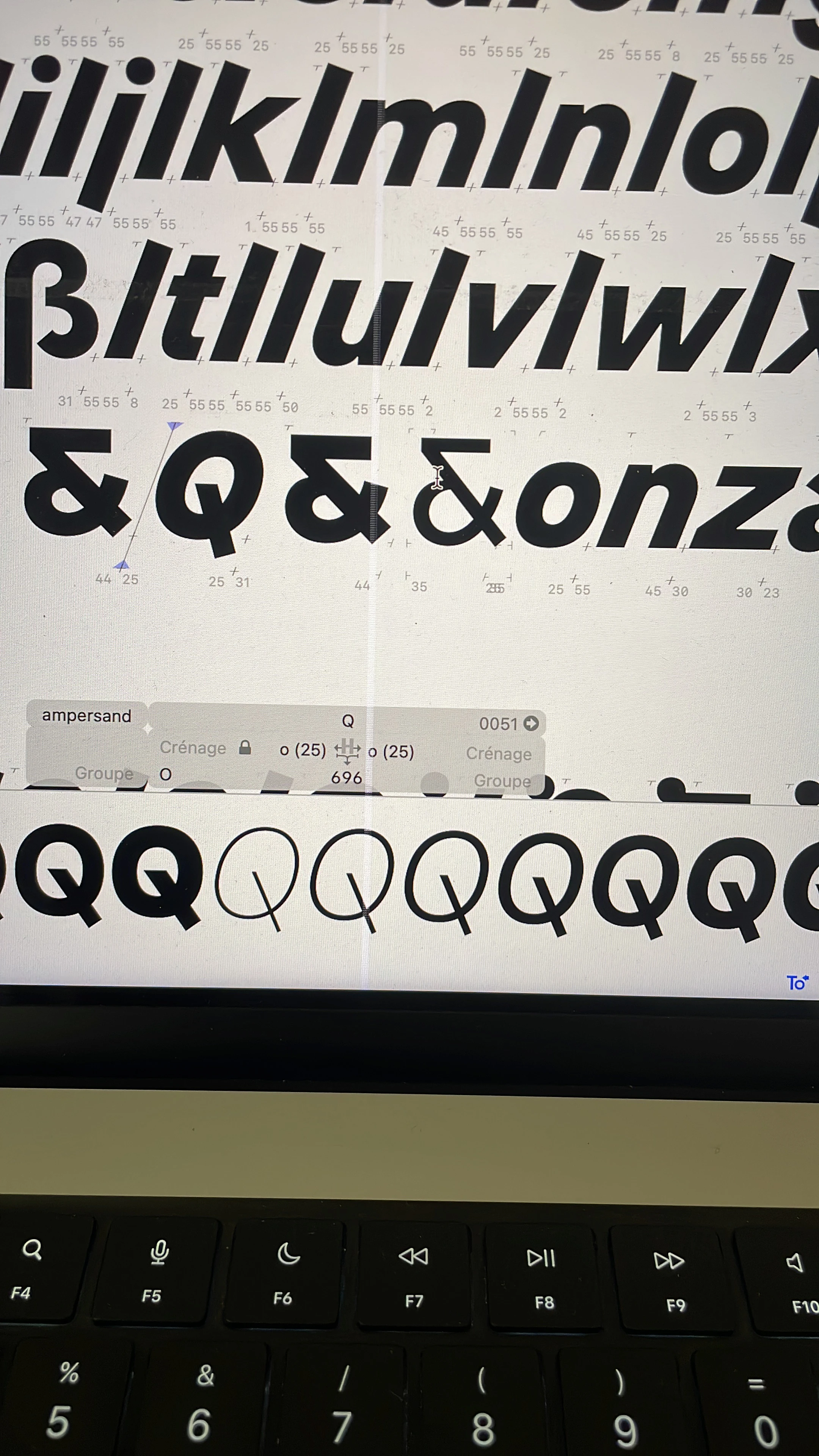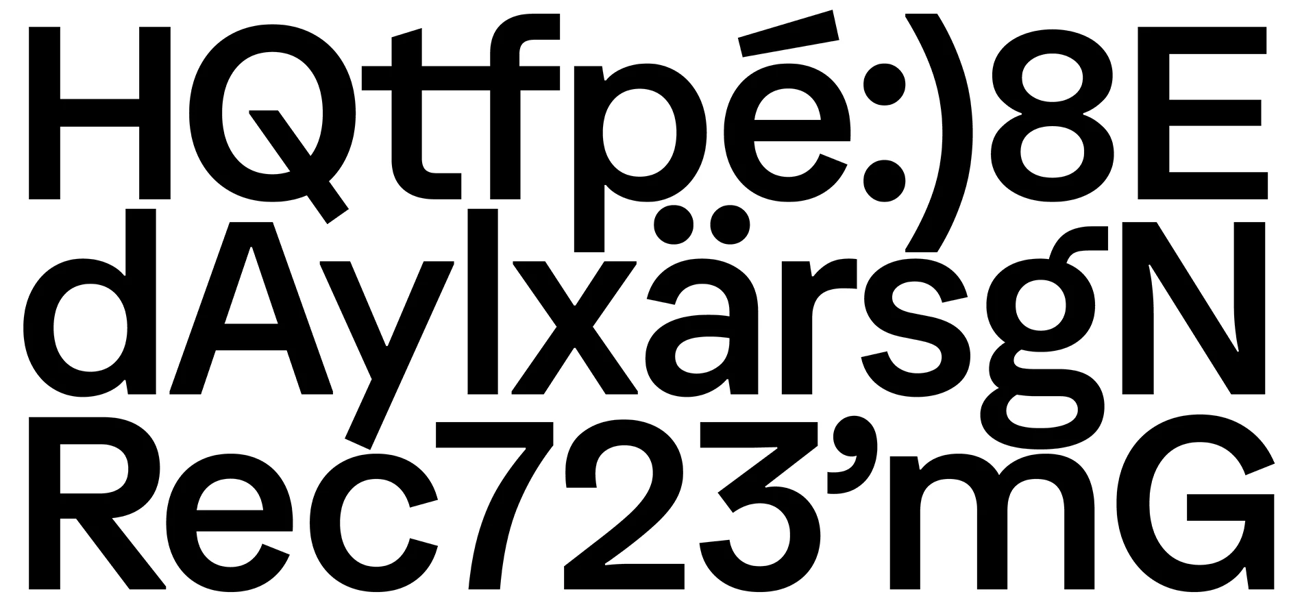
With this project, I’m trying to design my favourite typeface. Since it’s my first serious project, my influences and skills have evolved faster than the typeface itself. That’s why I named it after a jellyfish that claims to know how to navigate. My goal is to keep this variable typeface uniwidth, with both a slant and a weight axis. While it should work at display sizes, the main focus remains on readability.
| Status: | personal project |
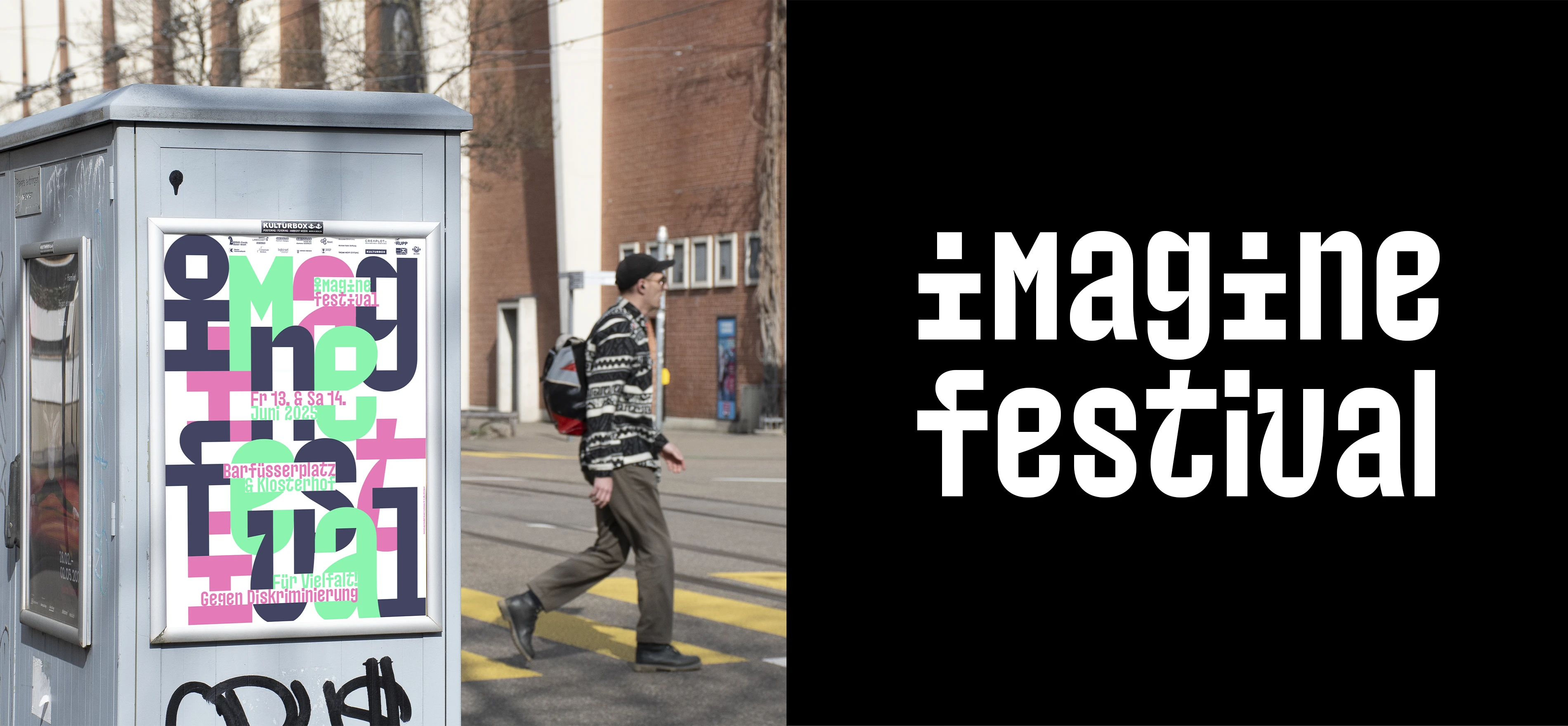
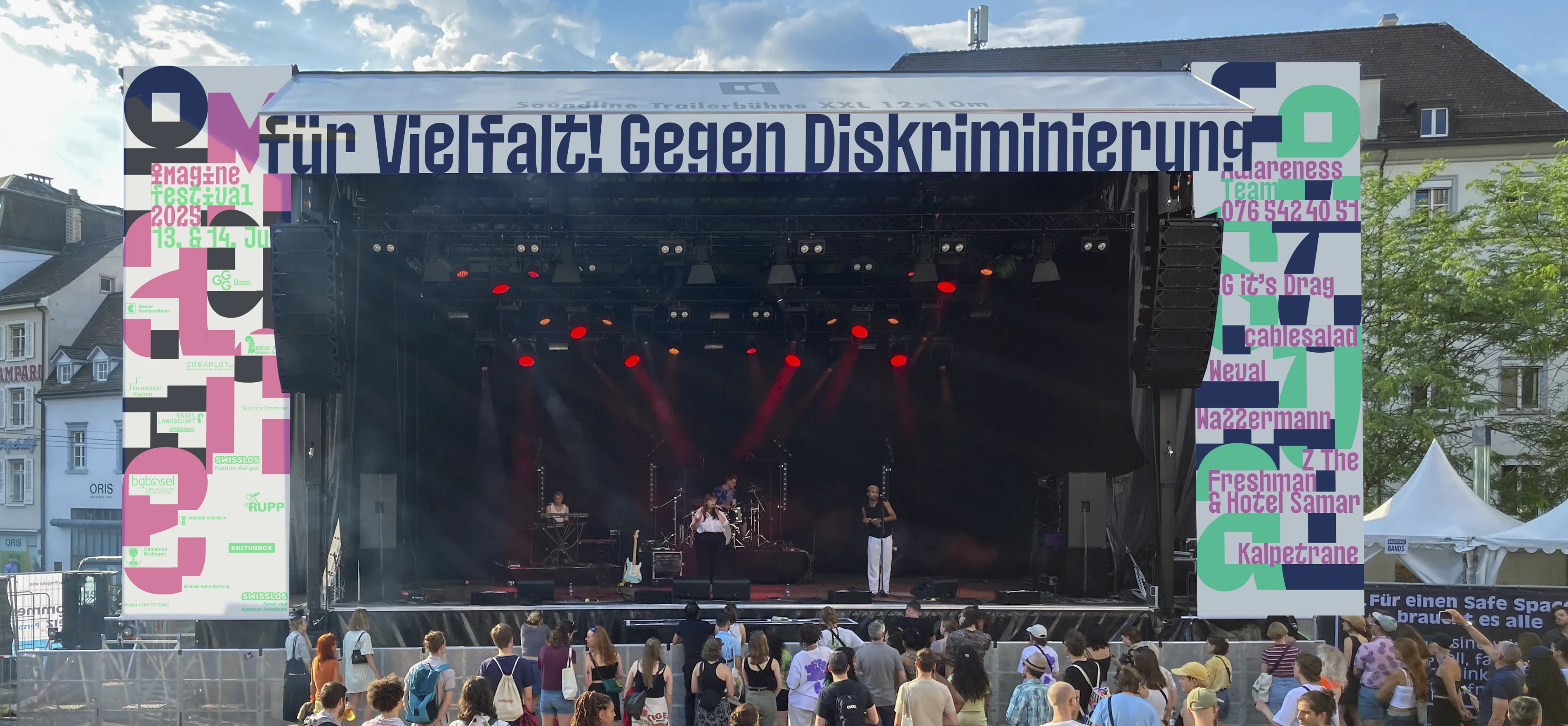
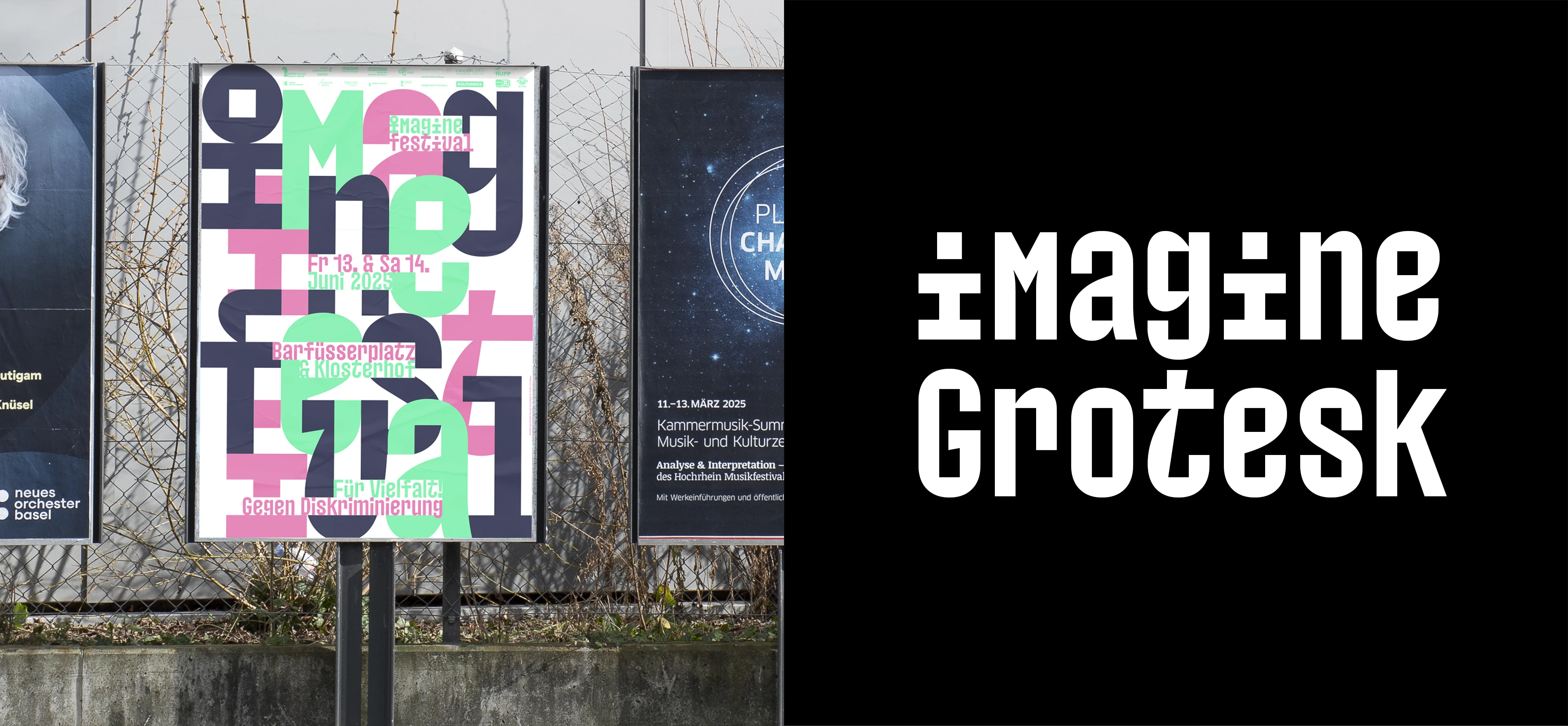
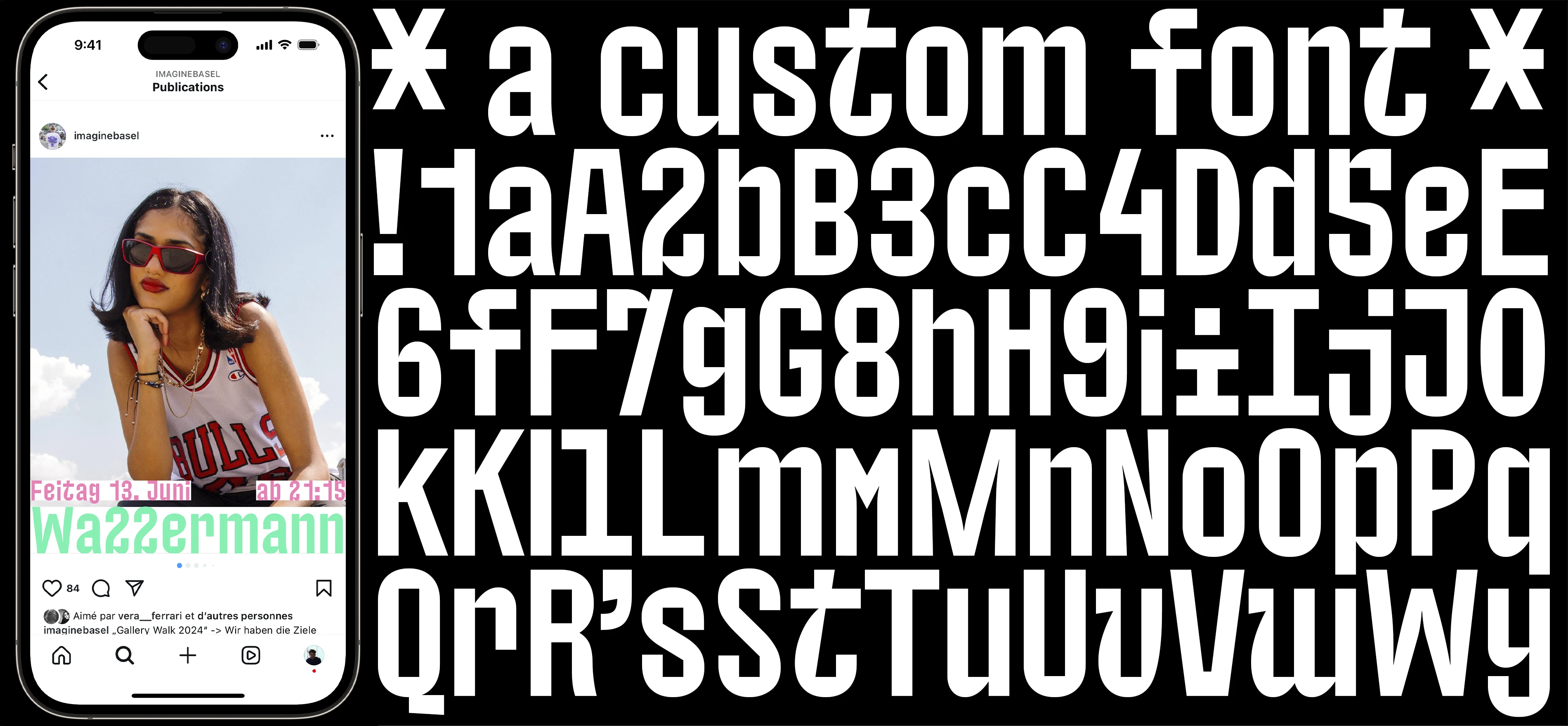

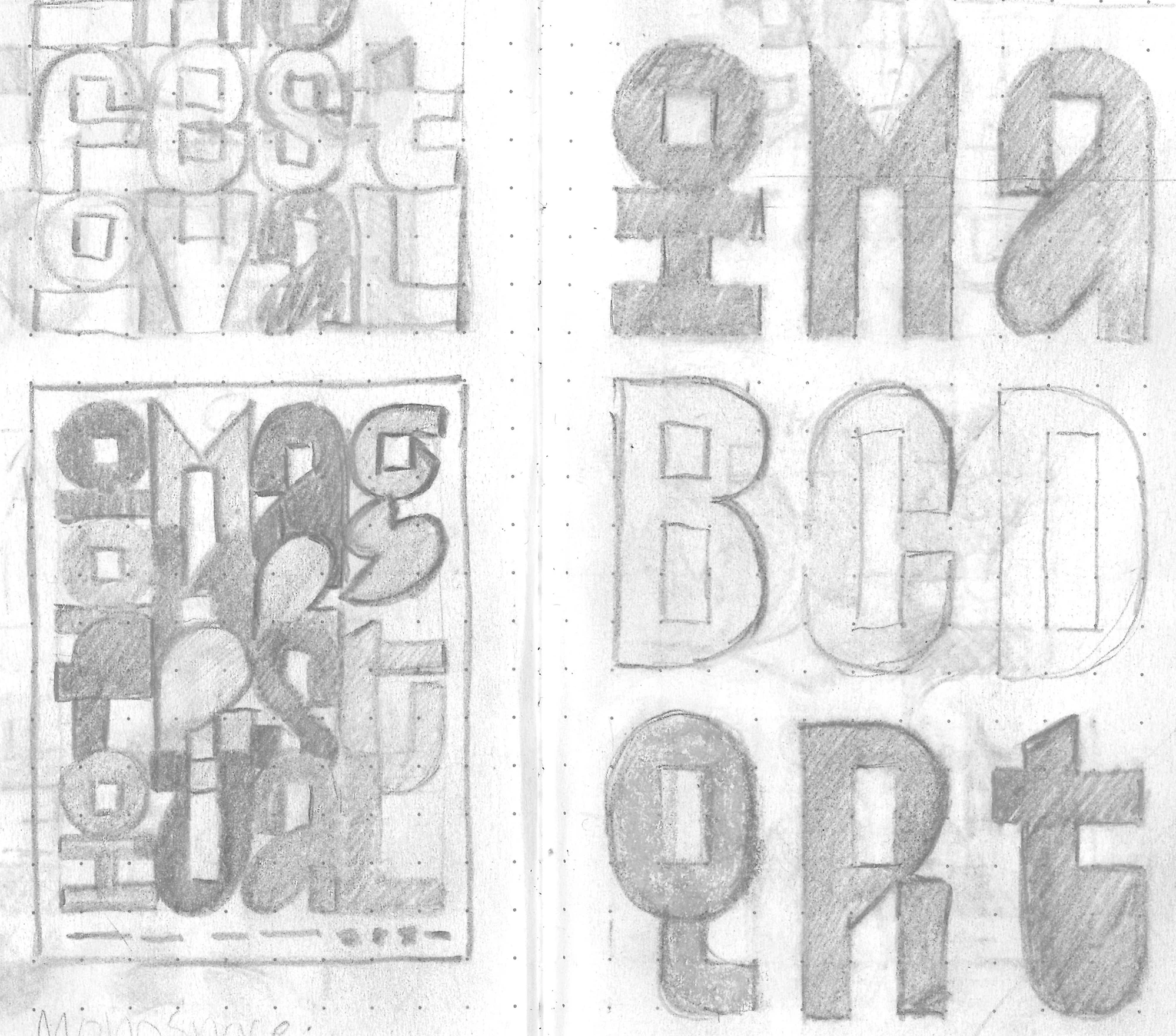
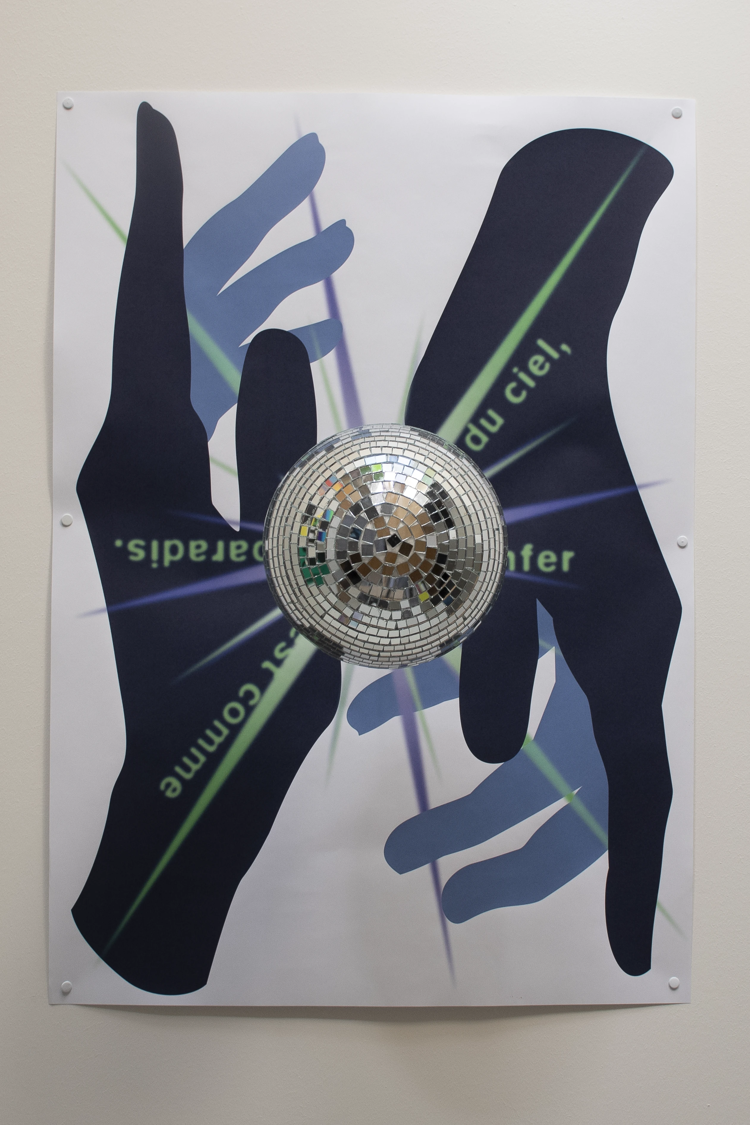
The imagine Festival is committed to diversity and against discrimination every year. The students of the graphic design class have the opportunity to participate in the competition for designing the poster, flyer, stage setup, and social media presence. I approached this project with a strong typographic focus and created a display typeface specifically for this occasion.
| Poster format: | F4 |
| Font: | imagine Grotesk & Velella Sans |
| Status: | not realised |
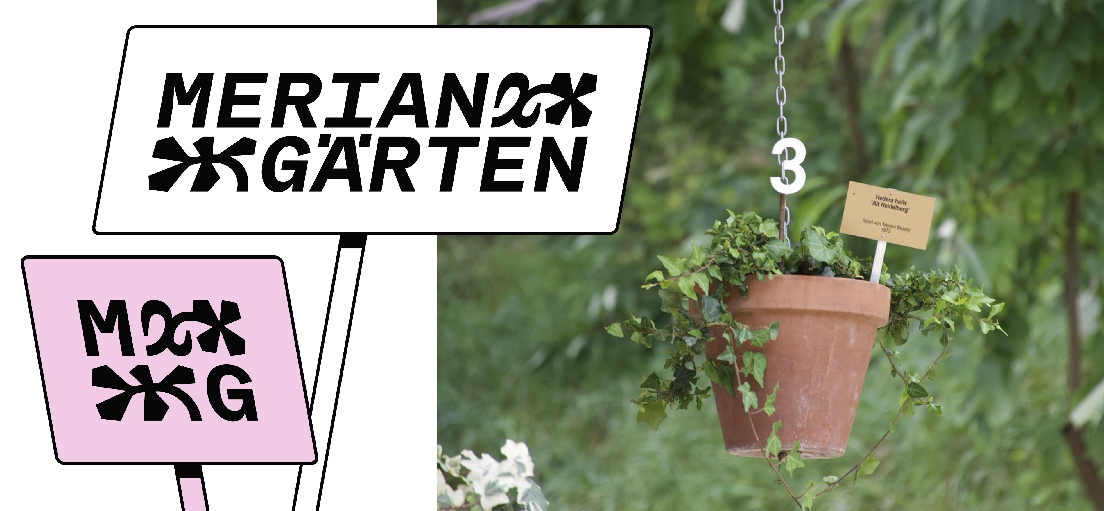
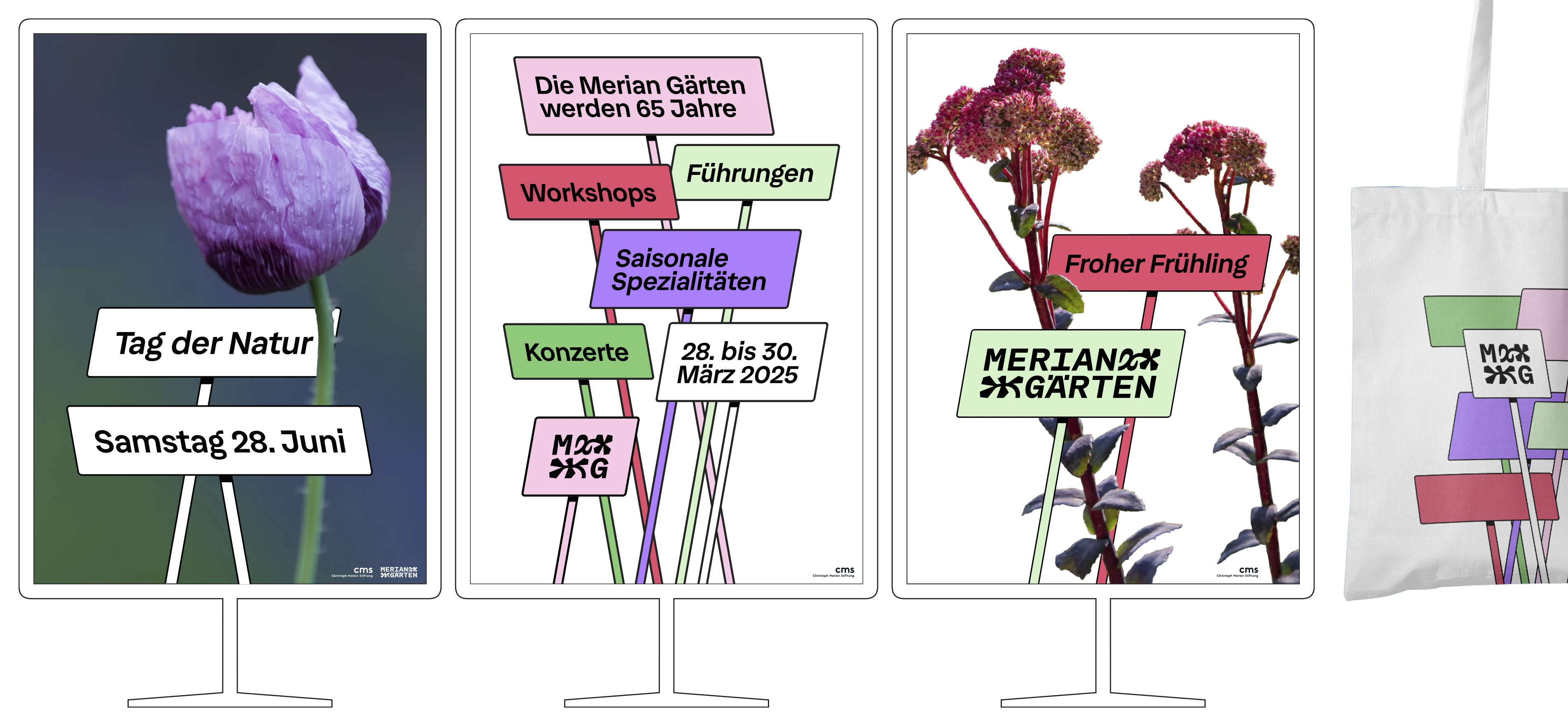
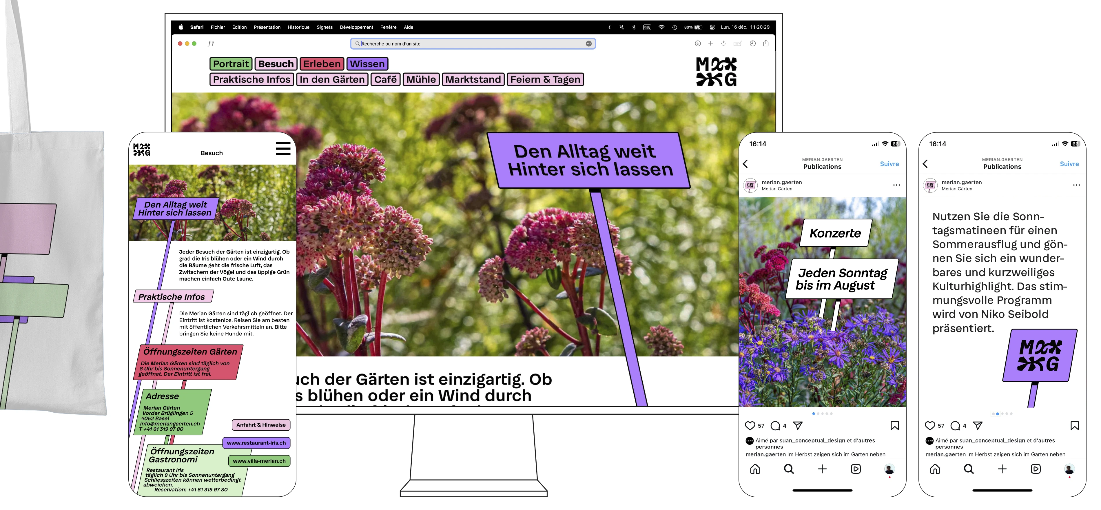
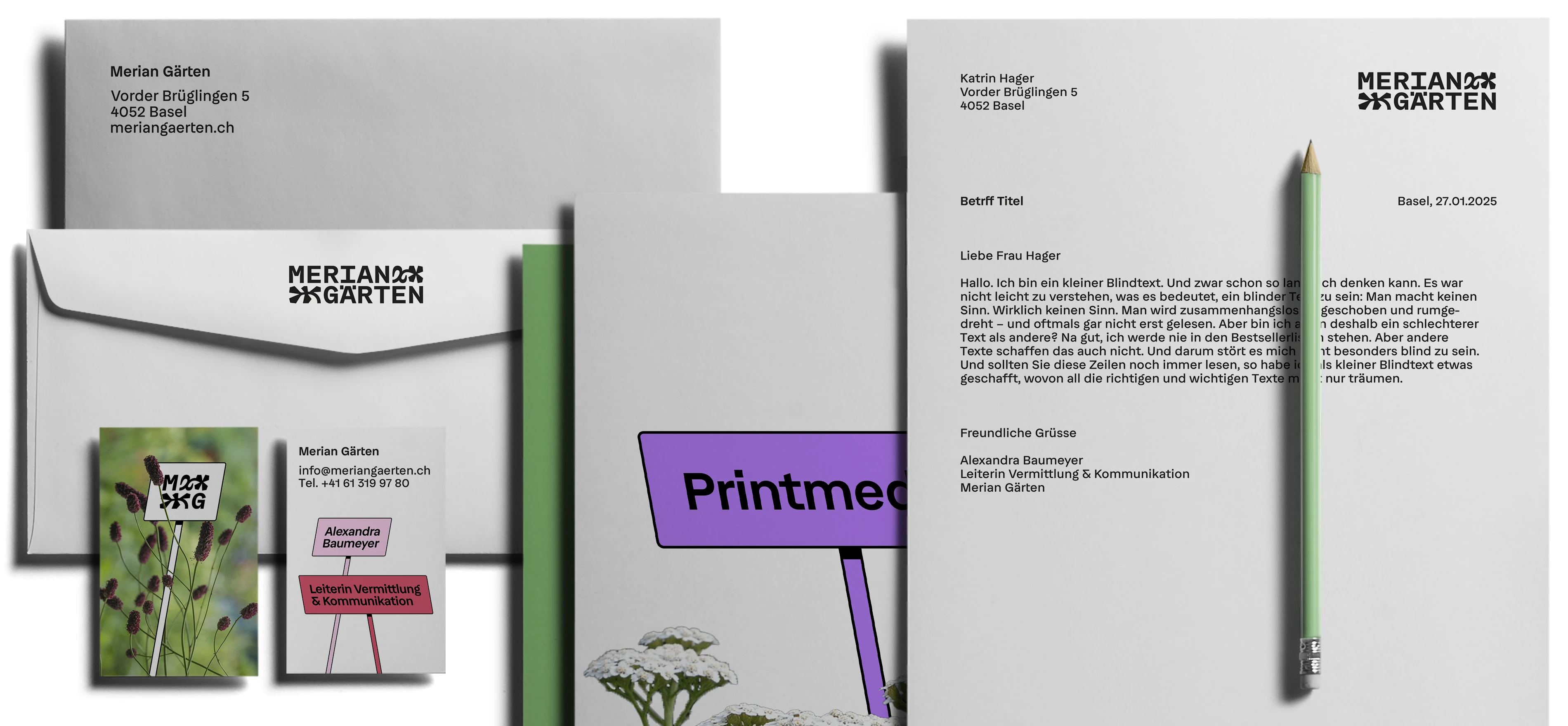
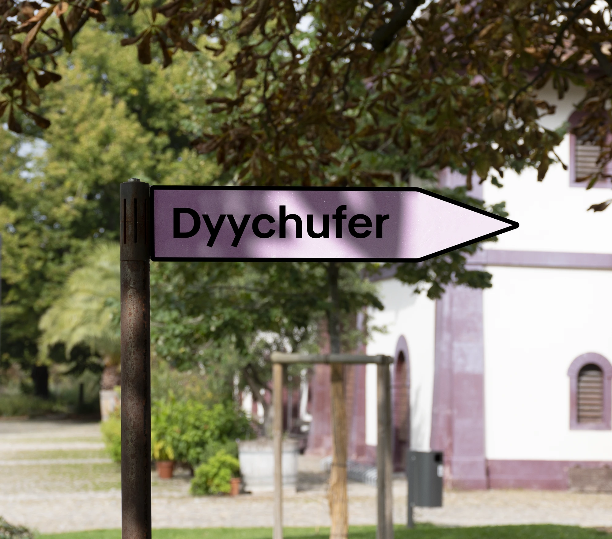
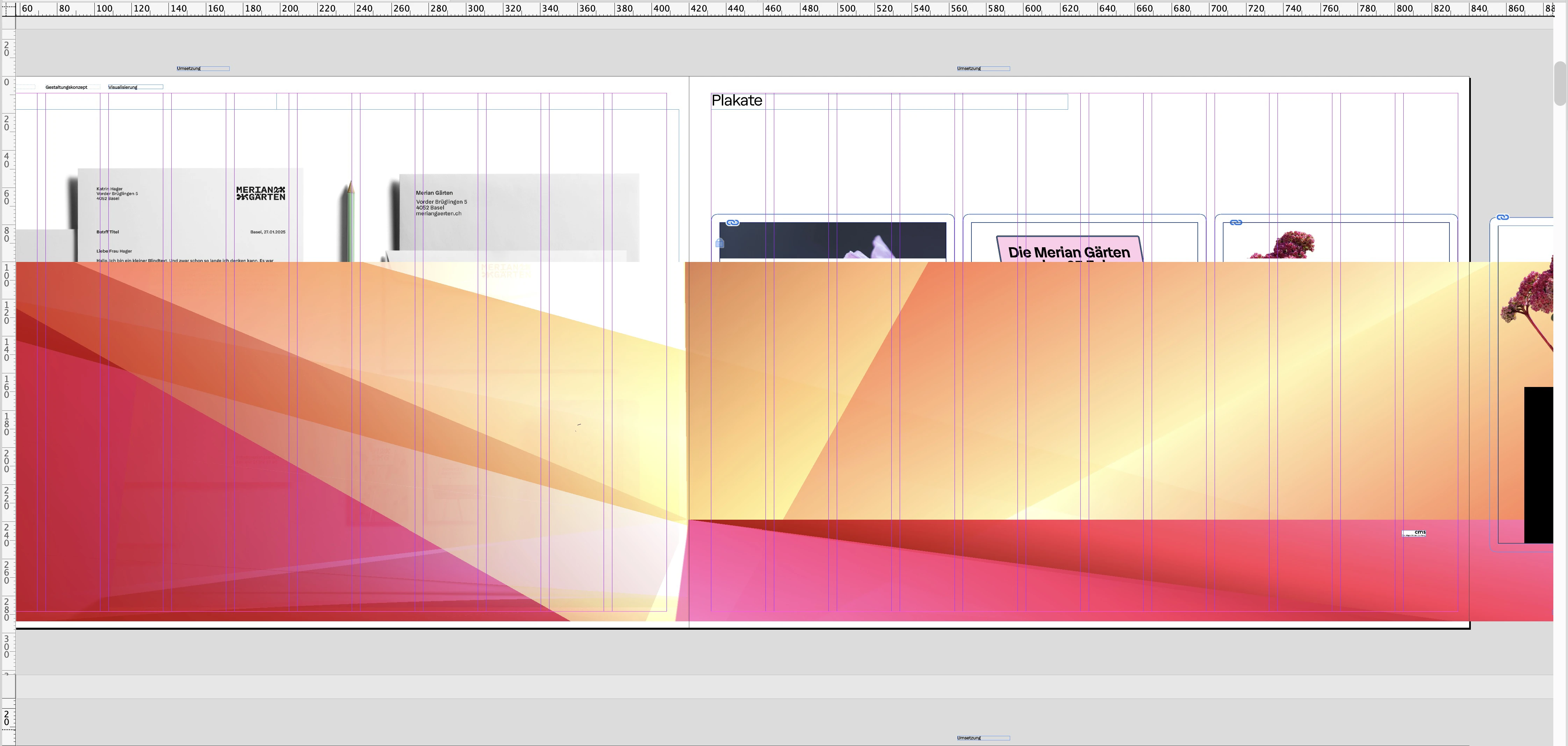
A fictional rebranding of the Merian Gärten. Since the Merian Gärten include botanical gardens, many plants are labelled with small signs displaying their German and Latin name. In my concept, these signs are used as graphic elements in various contexts.
| Font: | Velella Sans |
| Status: | fictitious project |
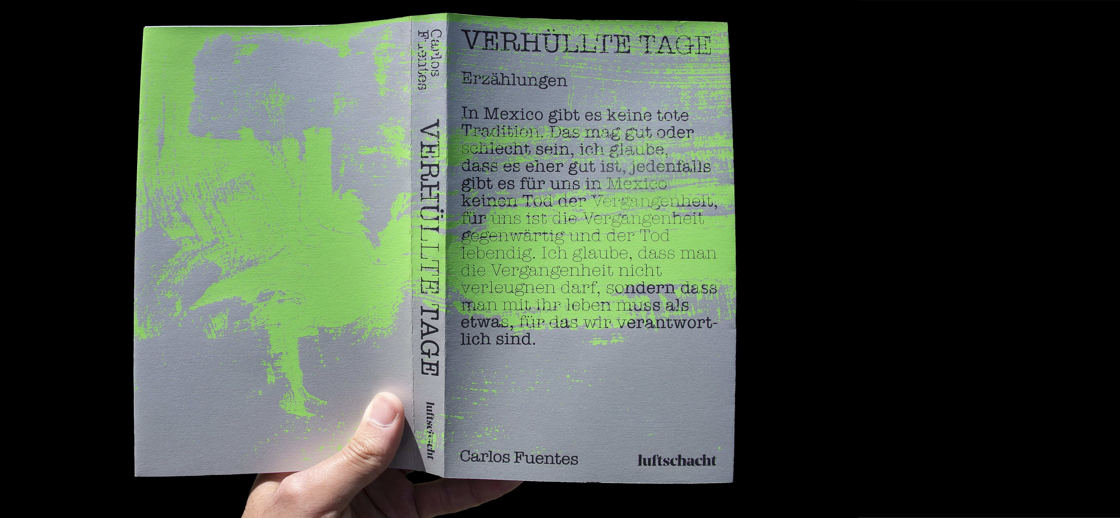
For this school project, I had the opportunity to design and screen print a book cover. The texture on the image layer makes the type appear in a lighter weight.
| Format closed: | 130 mm × 210 mm |
| Format opened: | 275 mm × 210 mm |
| Technique: | Screen printing |
| Fonts: | American Typewriter Regular & Light |
| Status: | fictitious project |
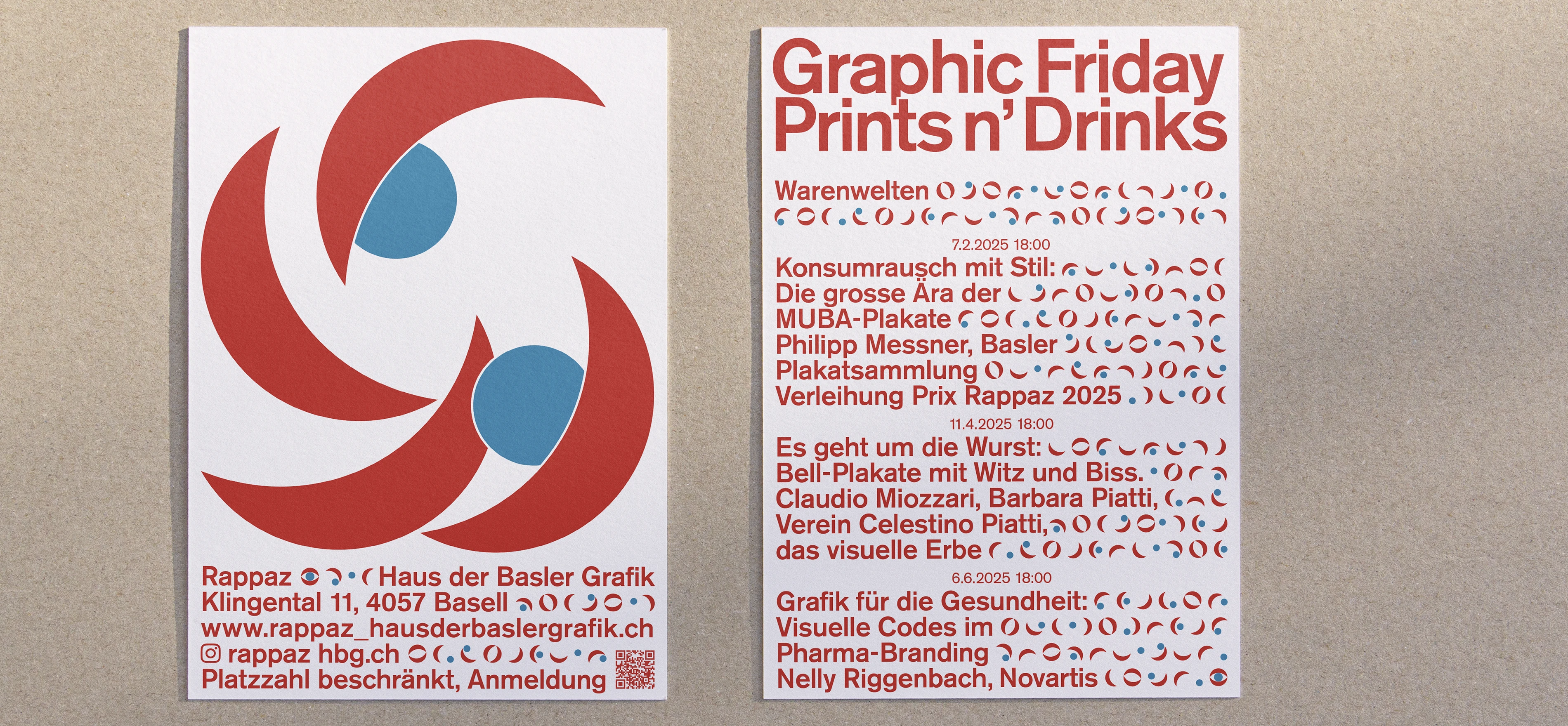

There was a competition in the graphic design class to design a poster and flyer for the Haus der Basler Grafik. Colours, typeface, and shapes were given.
| Poster format: | F4 |
| Flyer format: | A5 |
| Fonts: | Akzidenz Grotesk Regular & Bold |
| Status: | not realised |
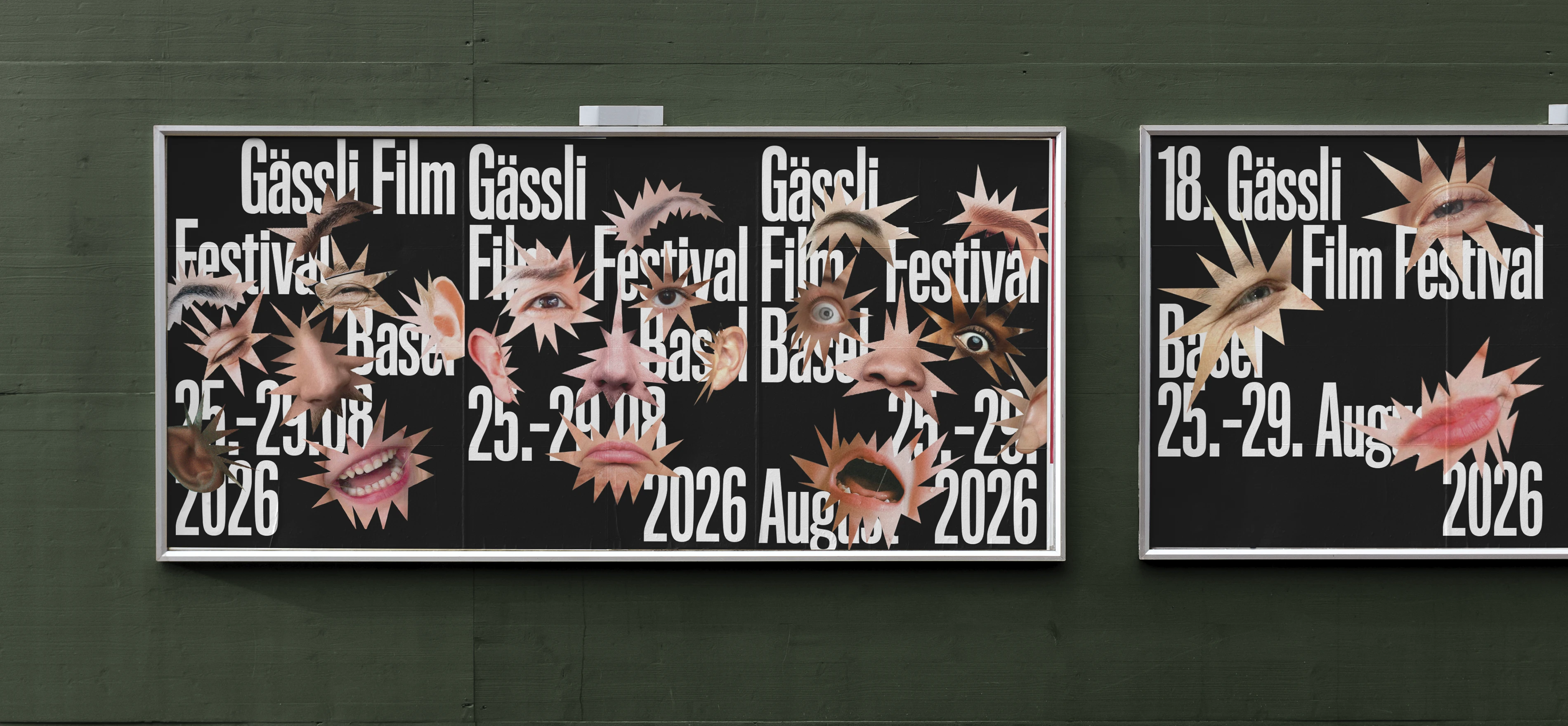
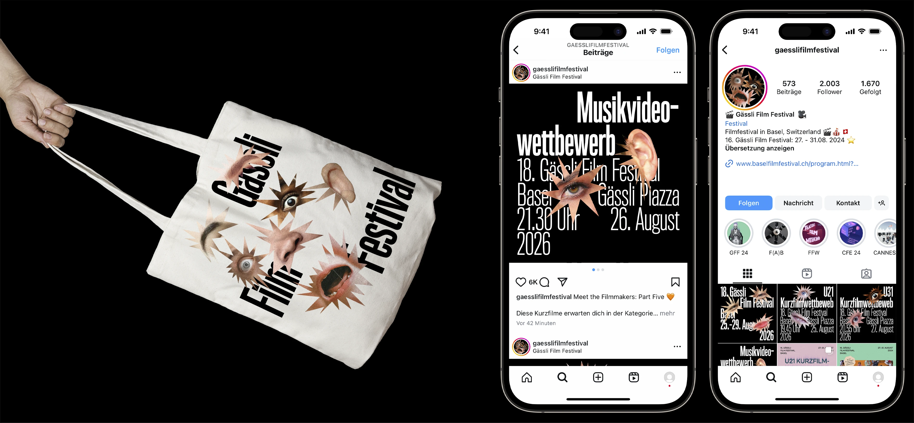
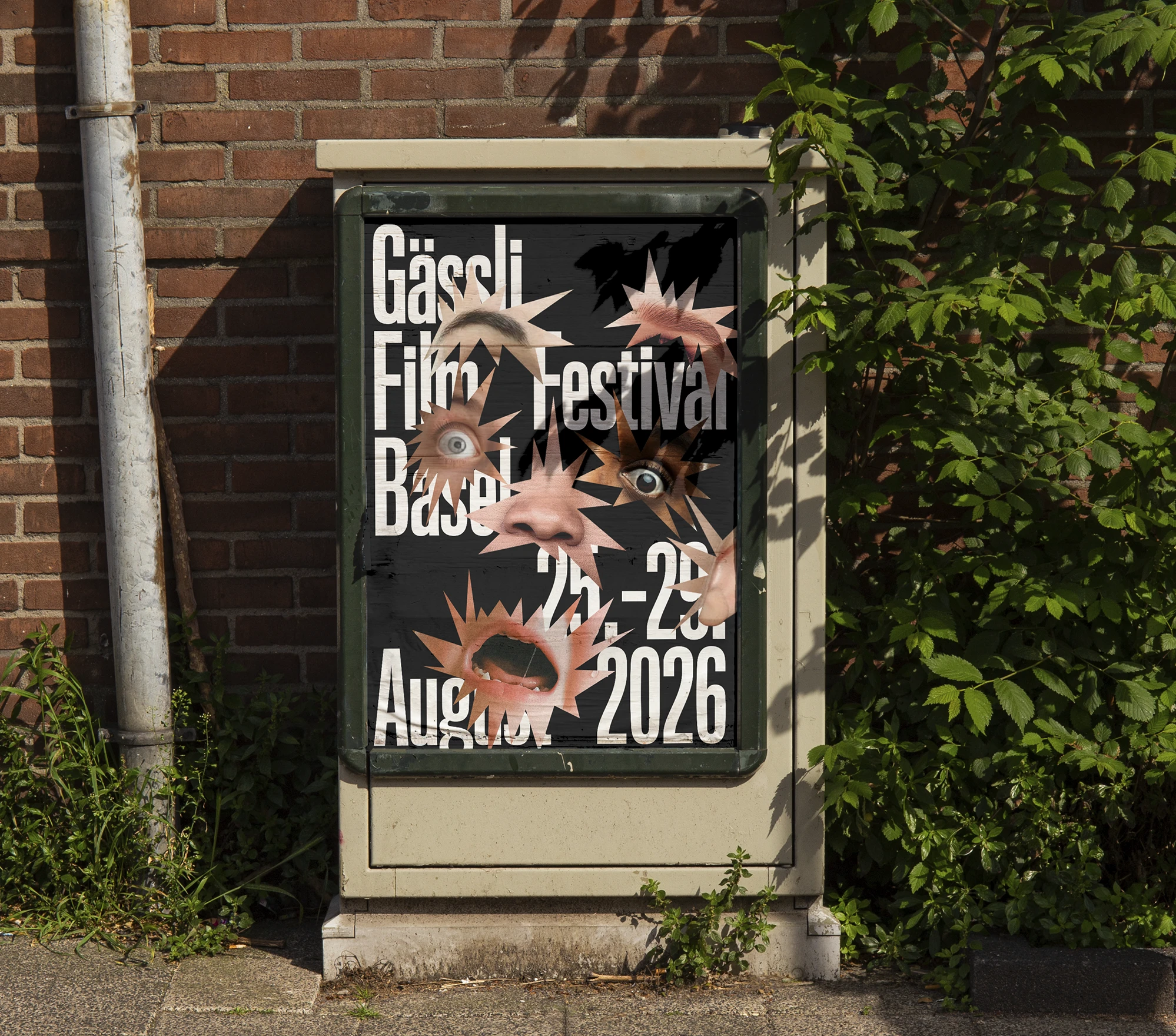
For the Gässli Film Festival, there was a competition in the graphic design class to design the festival’s appearance for the years 2026 to 2028. Together with Luc Schumacher and Alma Roth, I developed a concept for the festival’s visual identity. For the imagery and visual language, we decided to focus on the emotions of the audience.
| Font: | Titling Gothic FB Skyline Std |
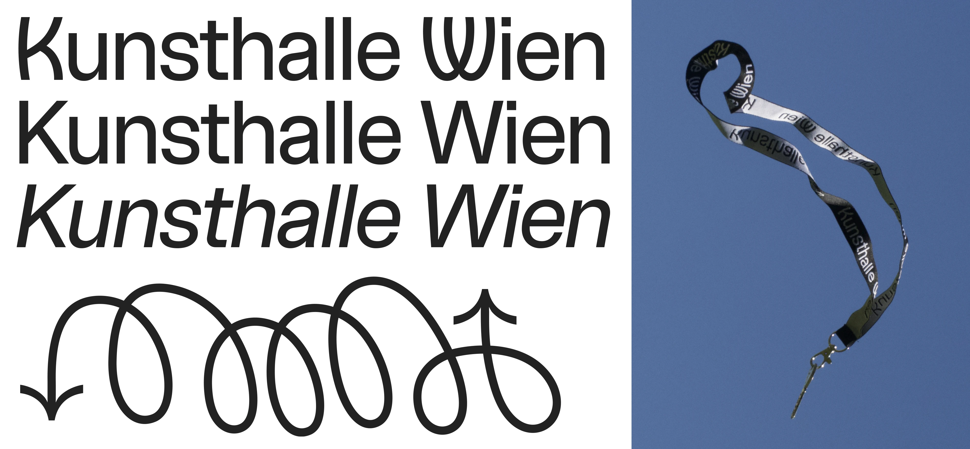
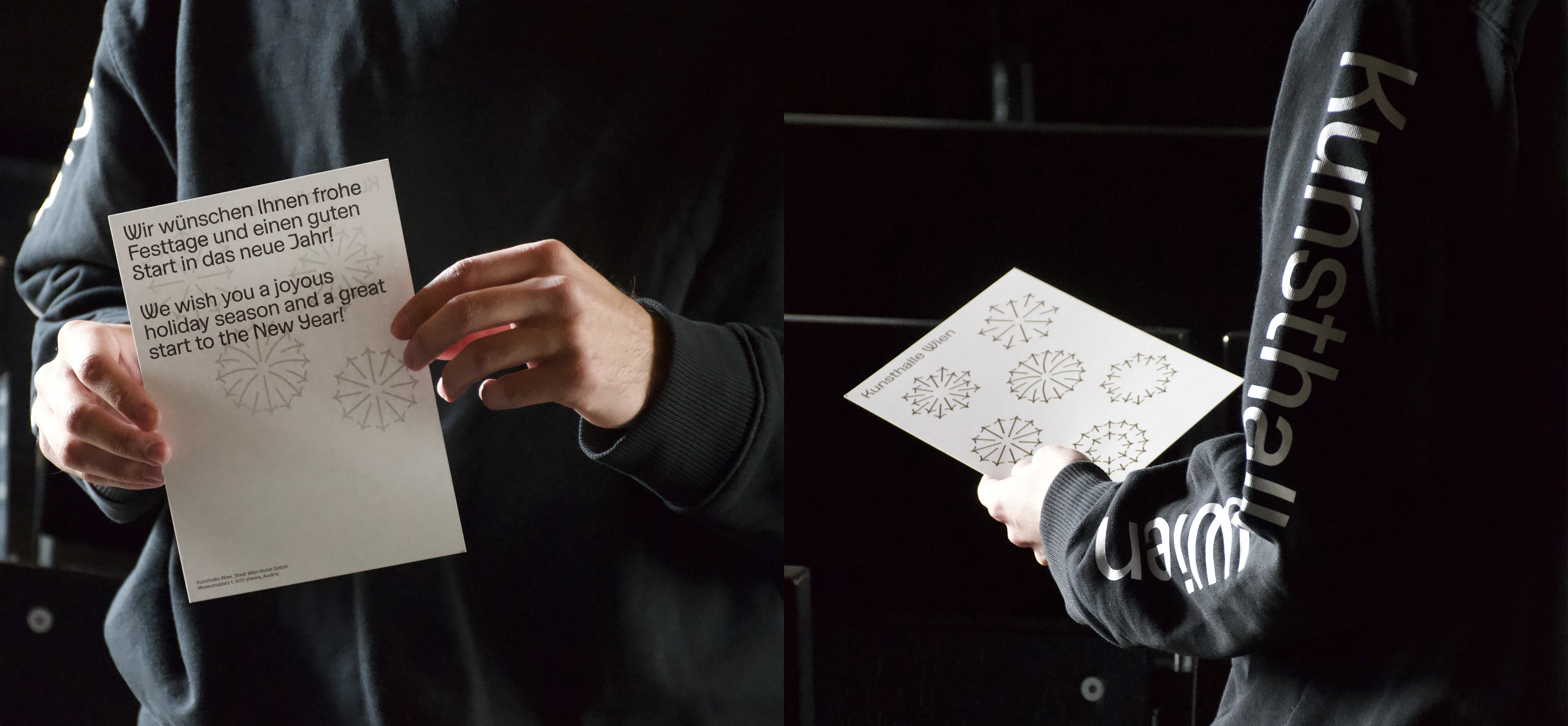
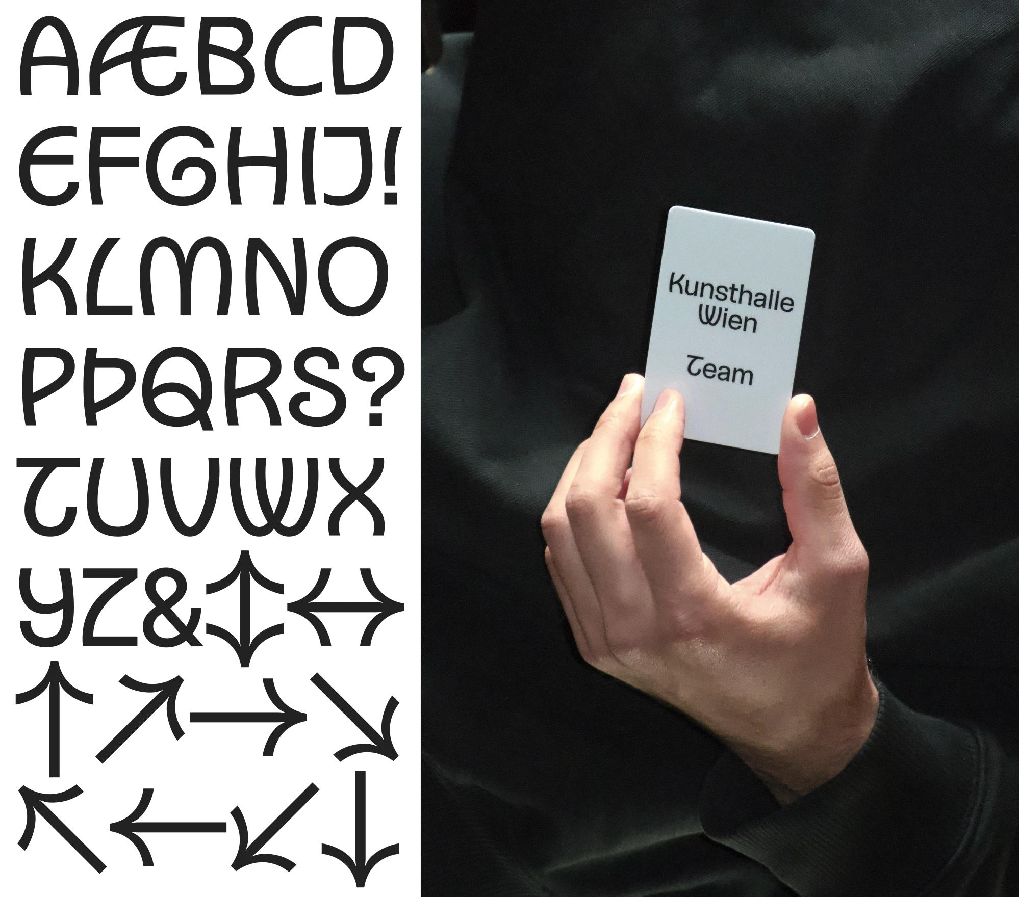
During my internship at RF Team, I had the opportunity to support Ronnie Fueglister and Yves Graber in the redesign of the corporate identity for Kunsthalle Wien. I was mostly involved in the development of the new custom typeface.
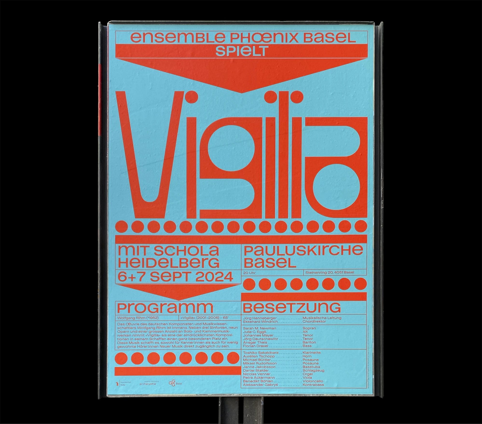
During my internship at RF Team, I had the opportunity to support Ronnie Fueglister and Yves Graber in the development of the third poster in a series for Ensemble Phoenix.
| Poster: | F4 |
| Status: | realised |
A design project for the annual autumn fair in Basel. The poster was meant to work equally well during the day and at night.
| Font: | ABC Maxi |
| Status: | fictitious project |
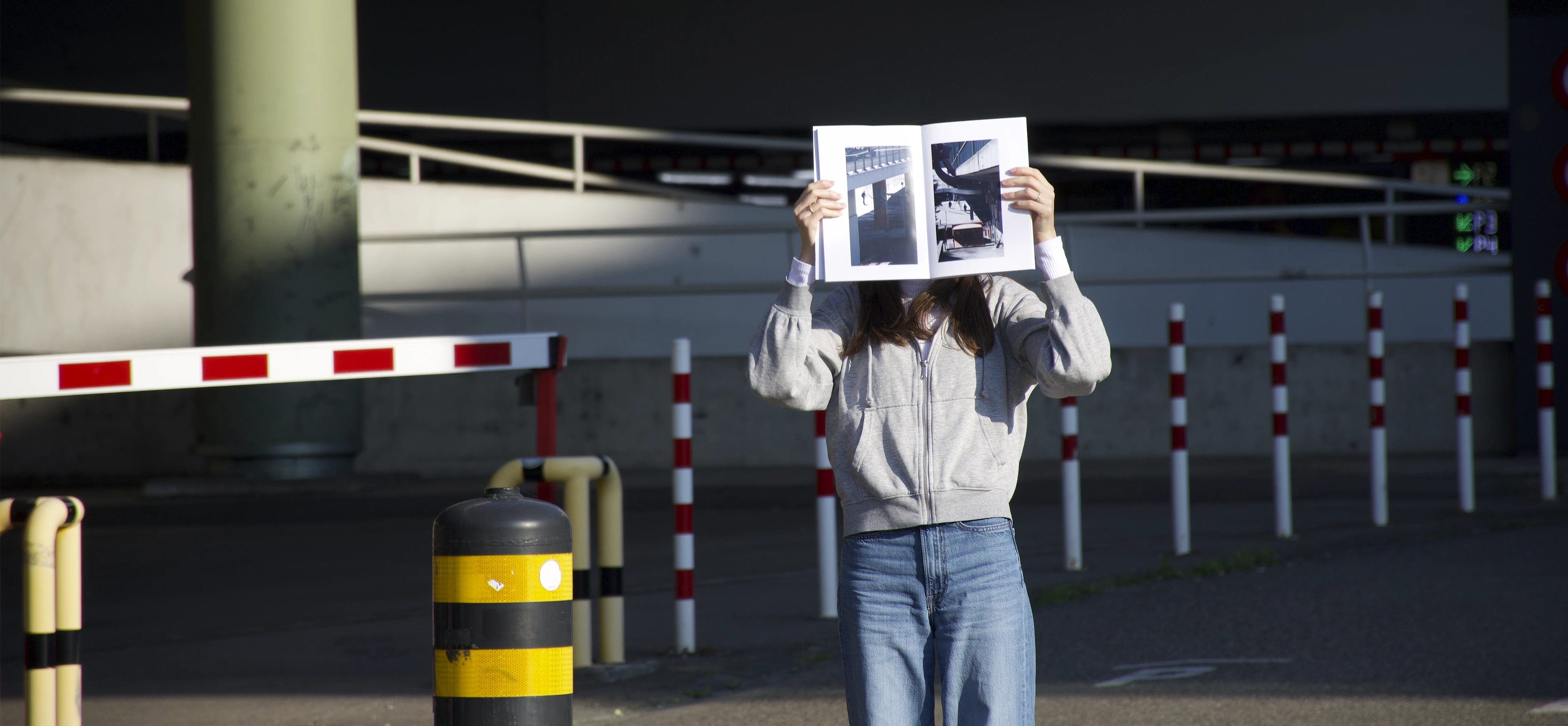
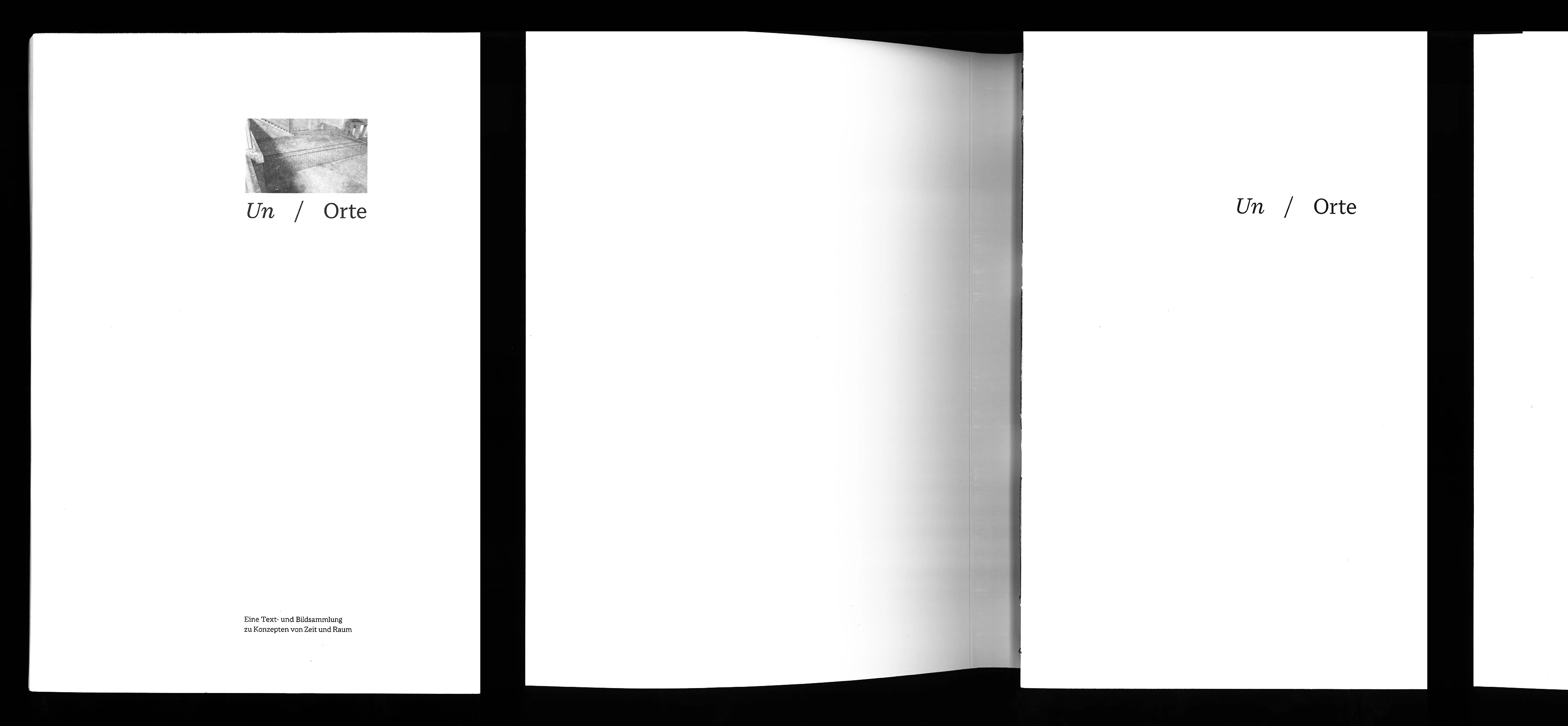

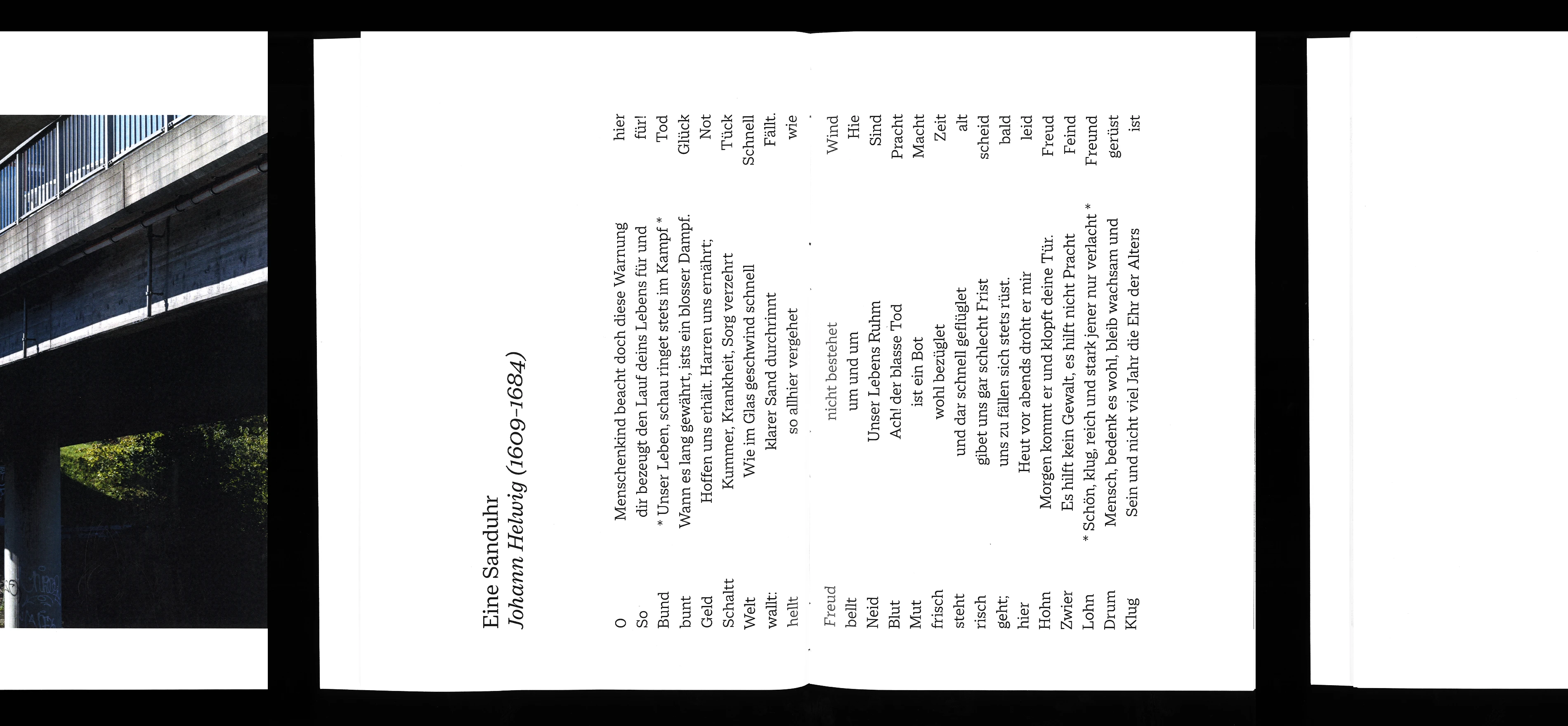

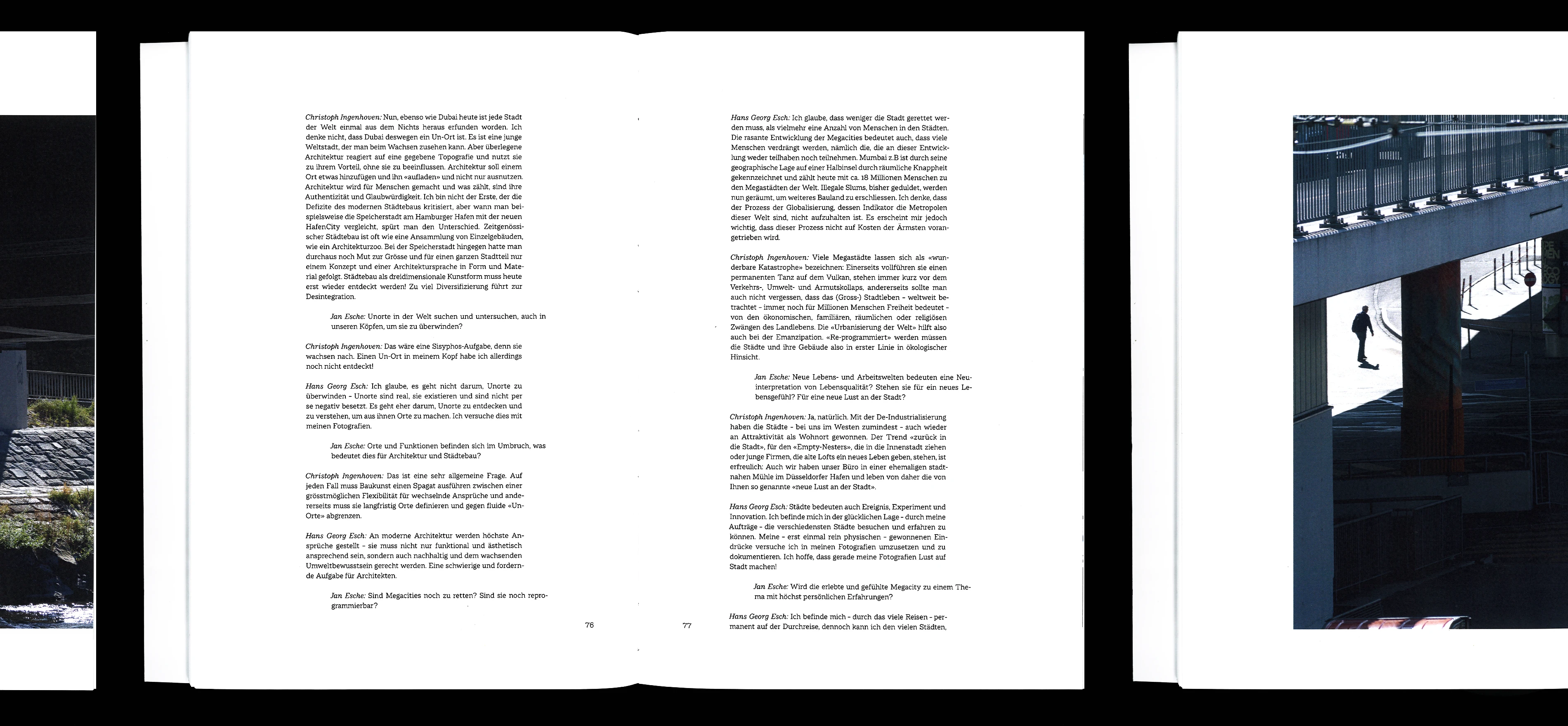
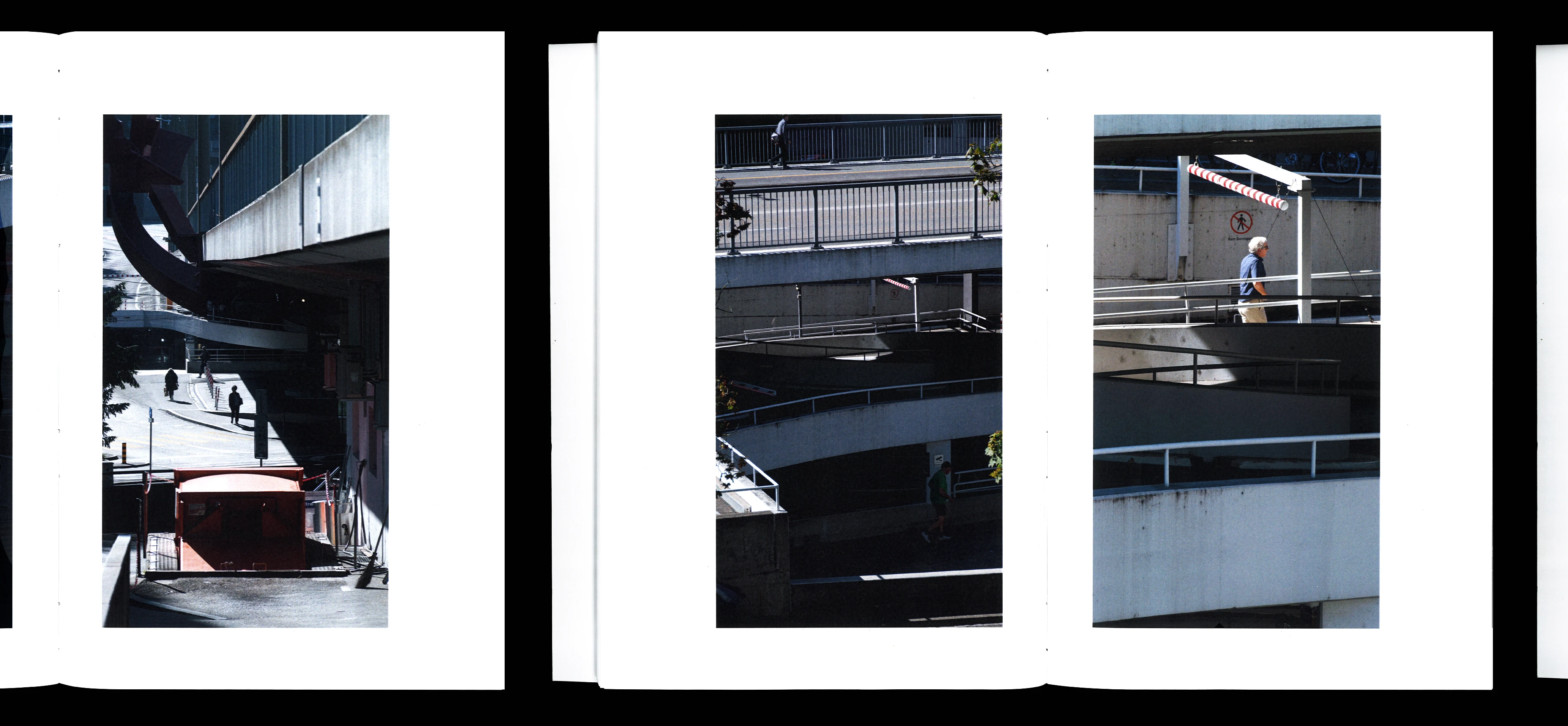
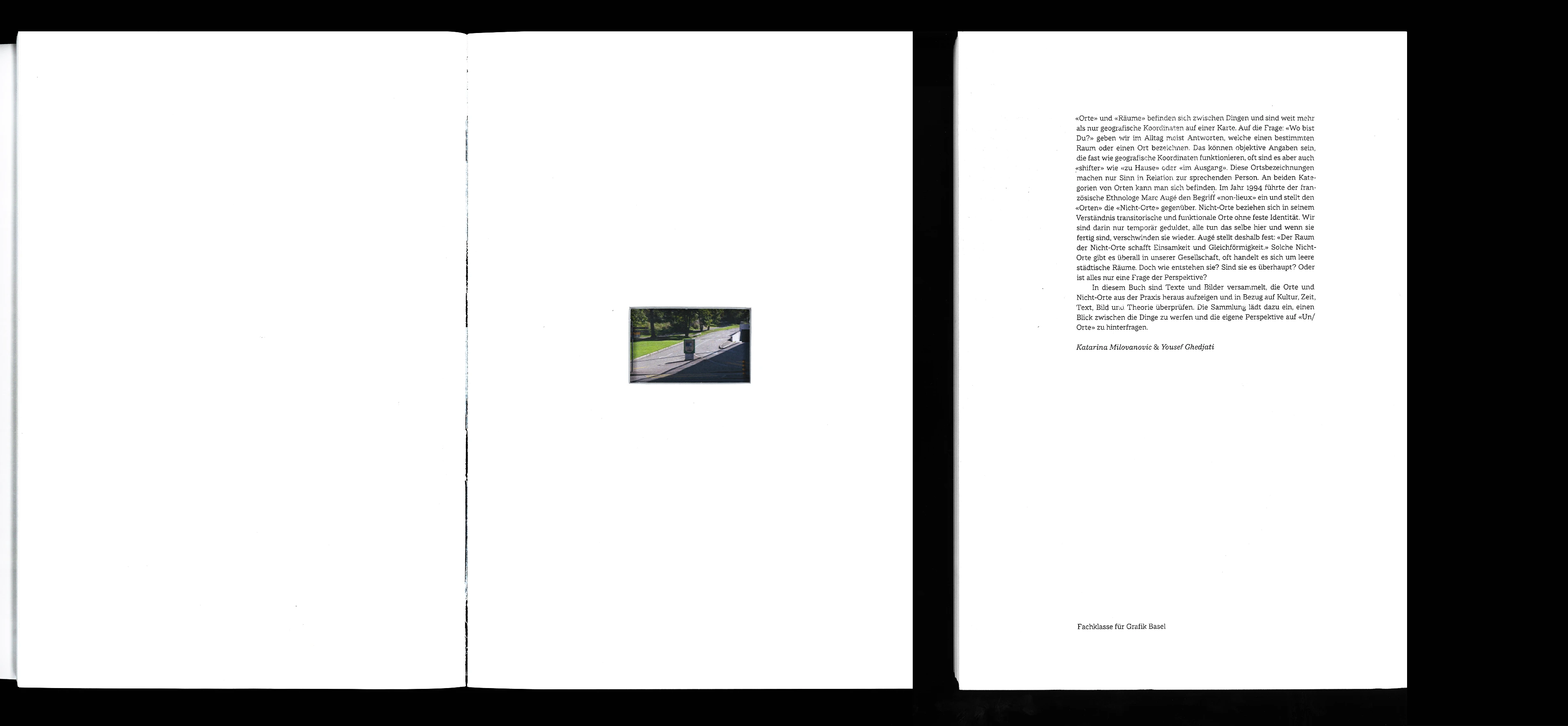
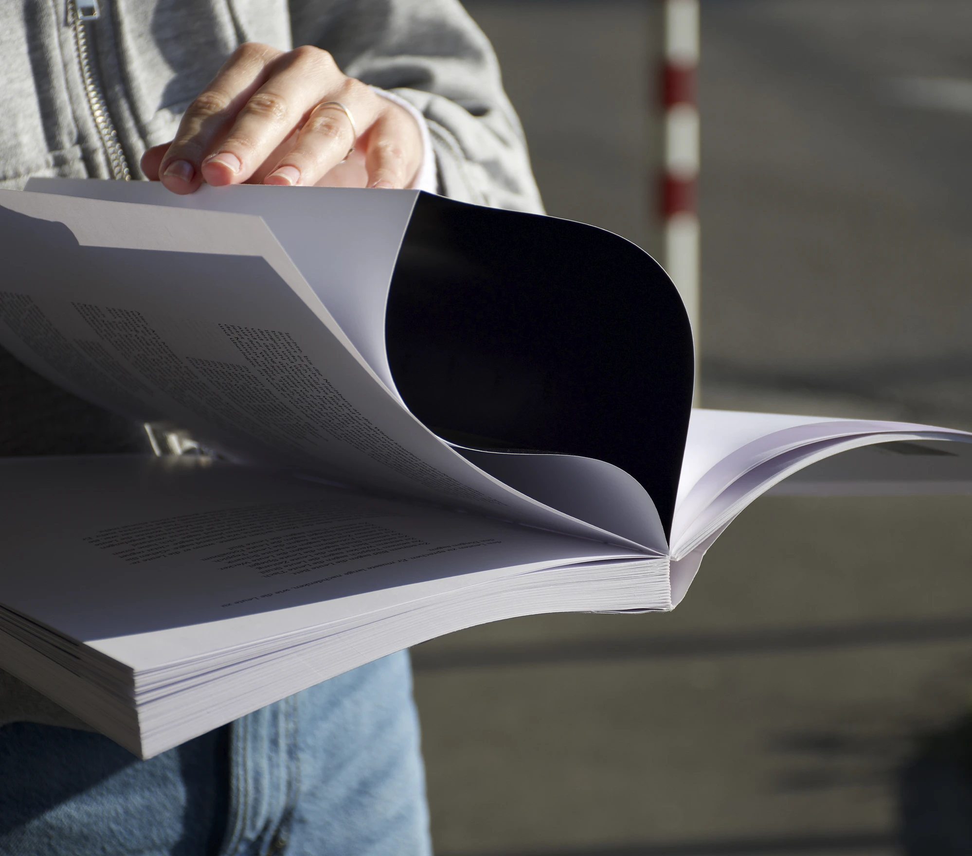
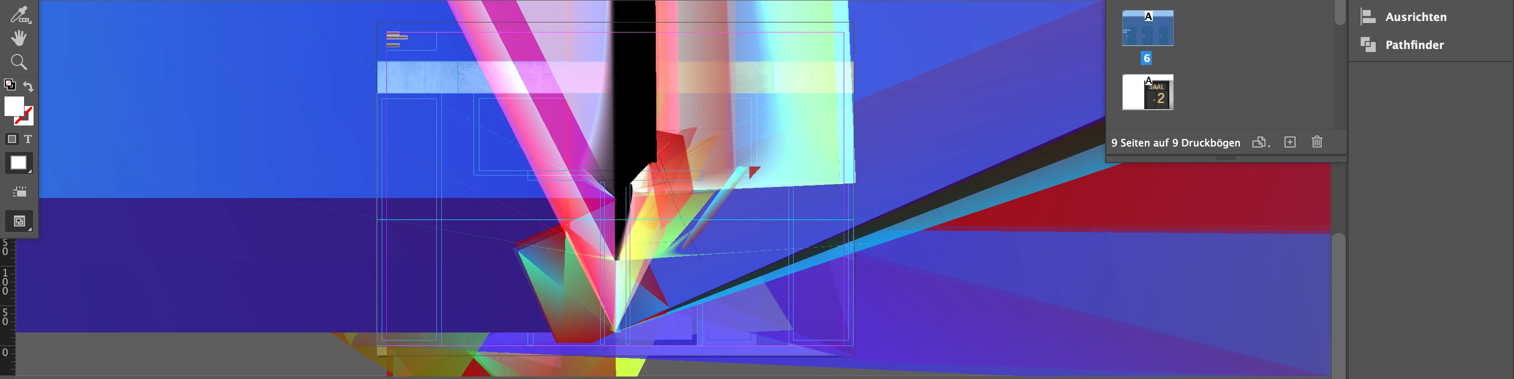
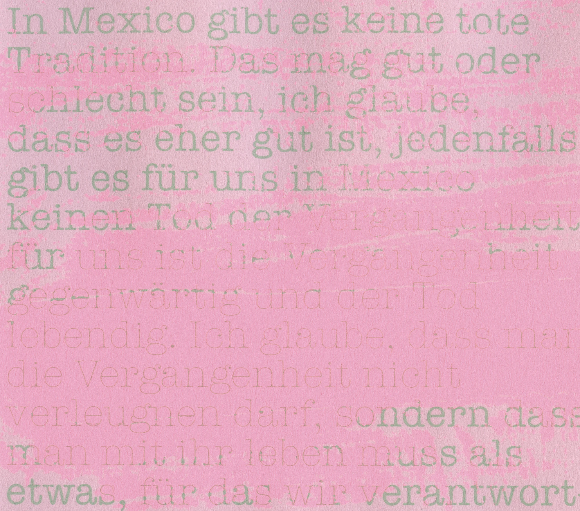
Together with Katarina Milovanovic, I conceived and created a book about “non-places.” To represent these non-places, we each produced a photo series. Through this project, I learned how to develop a book concept and how to work typographically with a large amount of text — and I became familiar with bookbinding techniques.
| Format closed: | 190 mm × 280 mm |
| Format opened: | 190 mm × 280 mm |
| Font: | Macklin Variable |
| Status: | fictitious project |
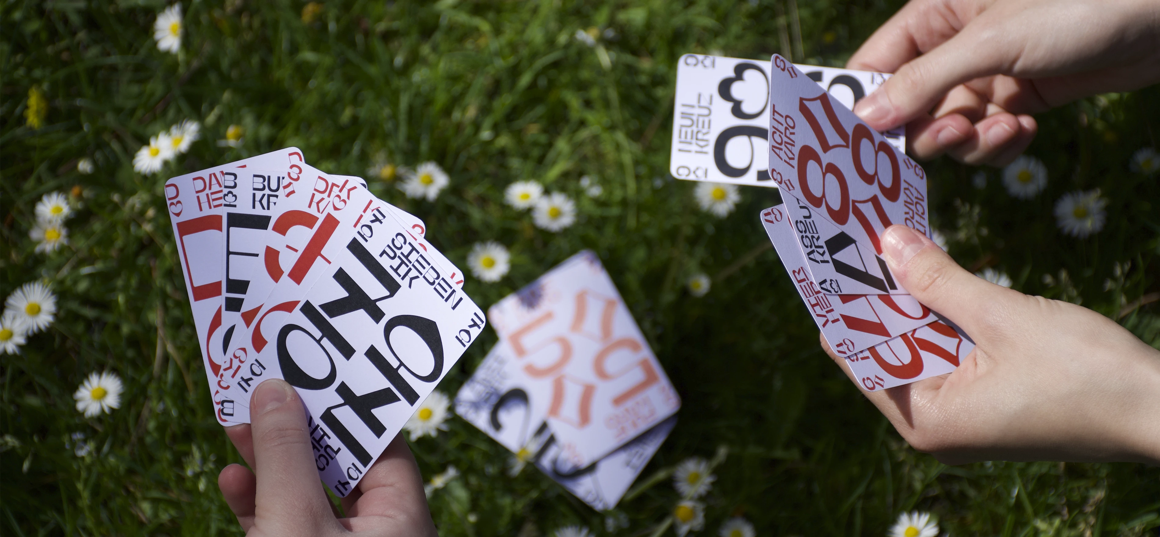
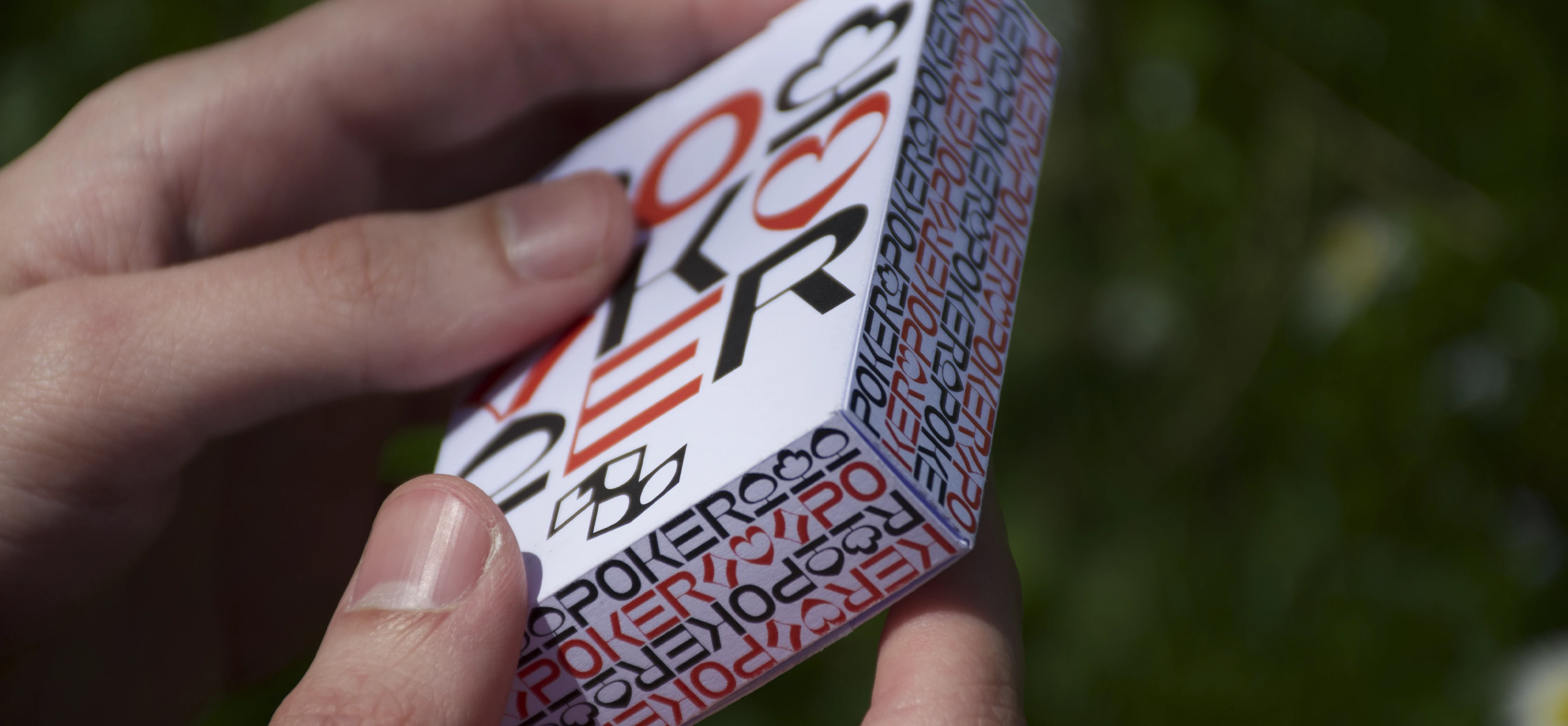
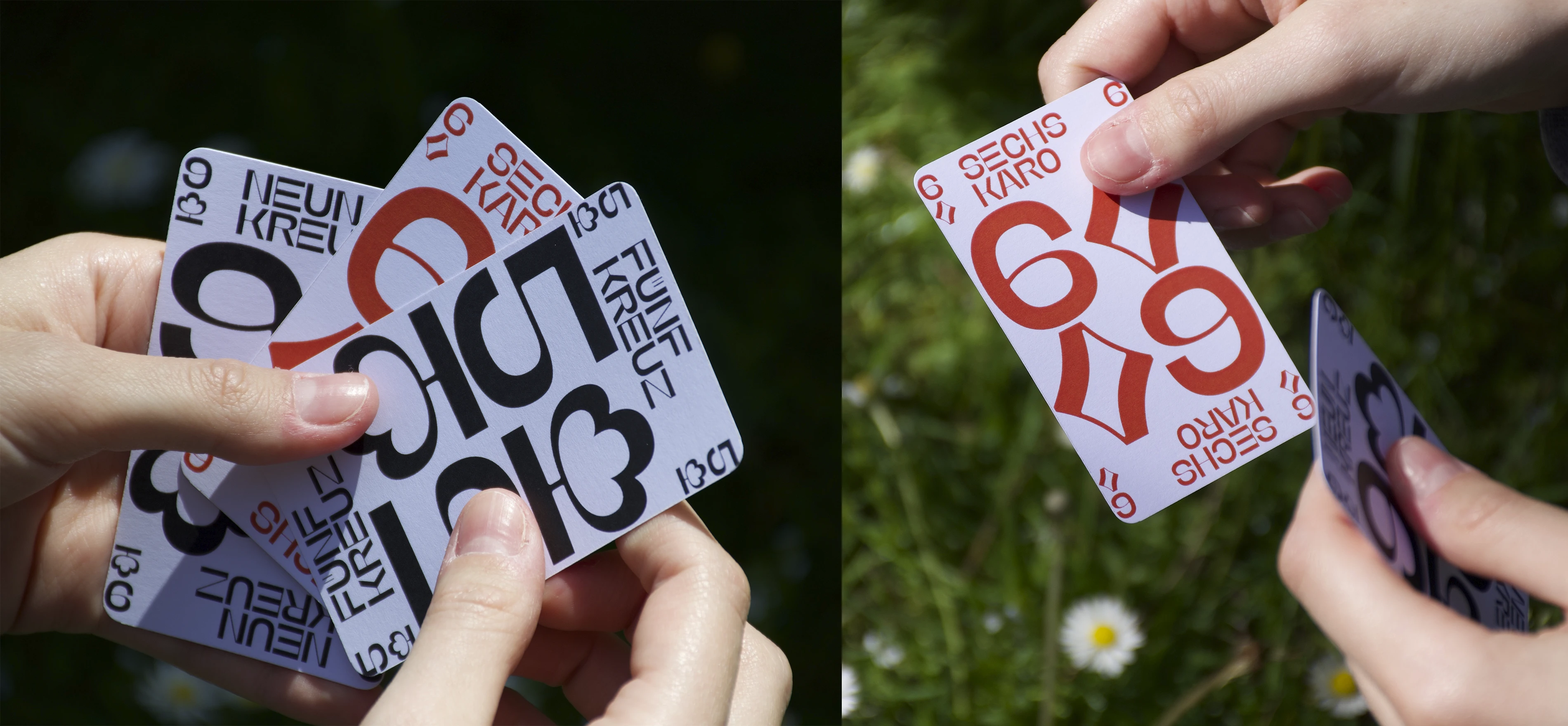
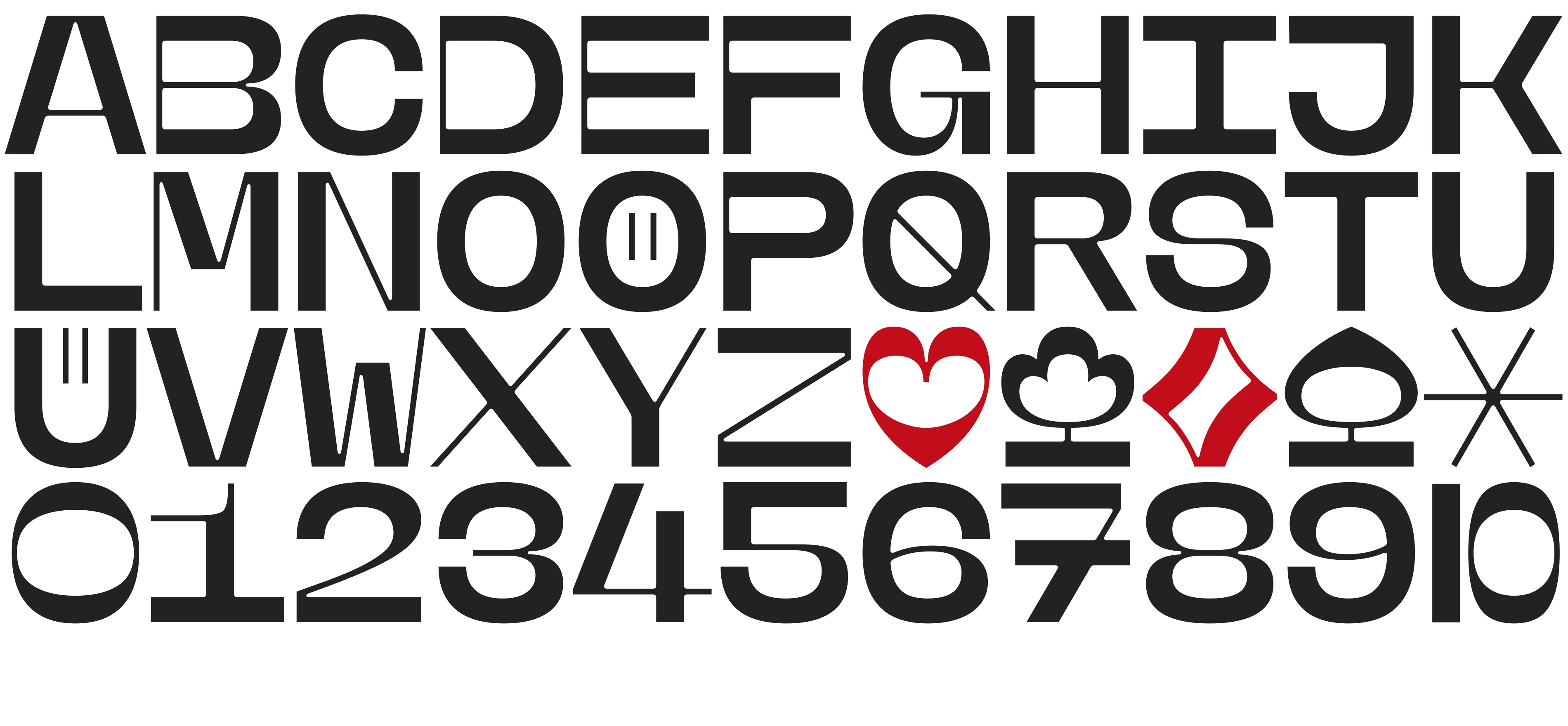
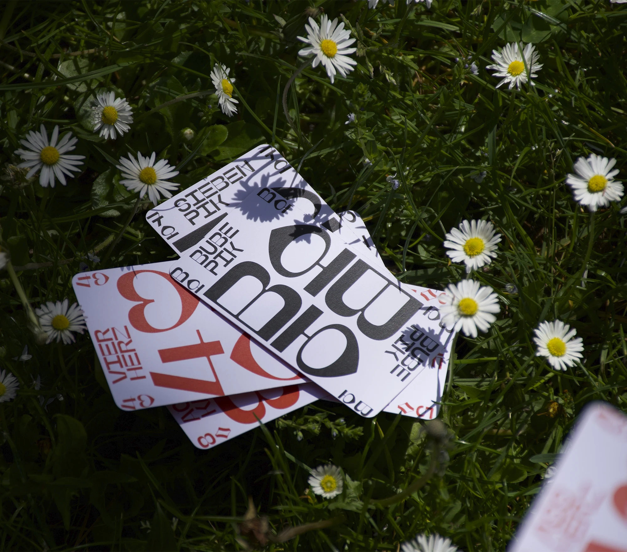
Here I’m showing one of the three games I designed. For this set of poker cards, I chose a strictly typographic approach. Since the numbers on the cards are often viewed upside down during a game, I took this into account when making optical adjustments to the characters.
| Font: | Custom font |
| Status: | fictitious project |
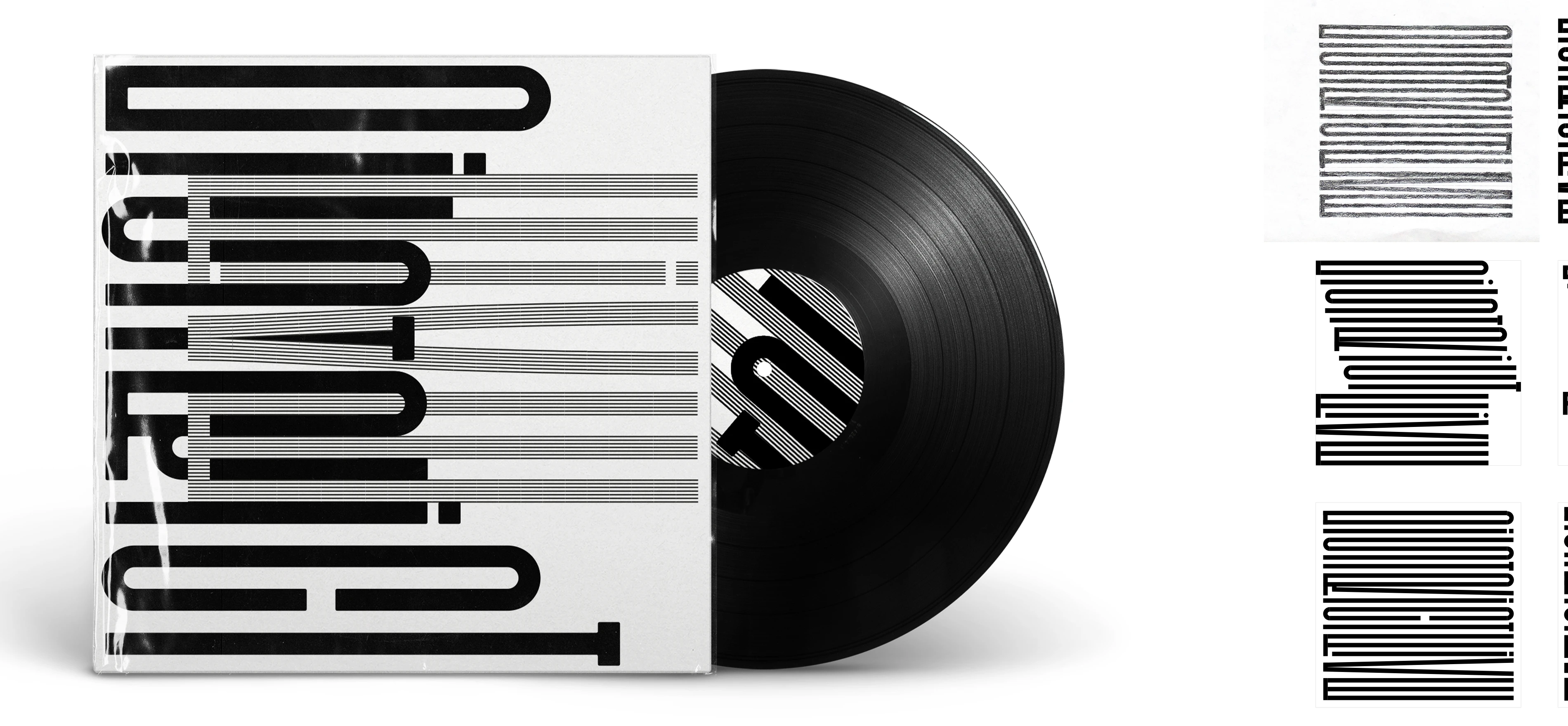
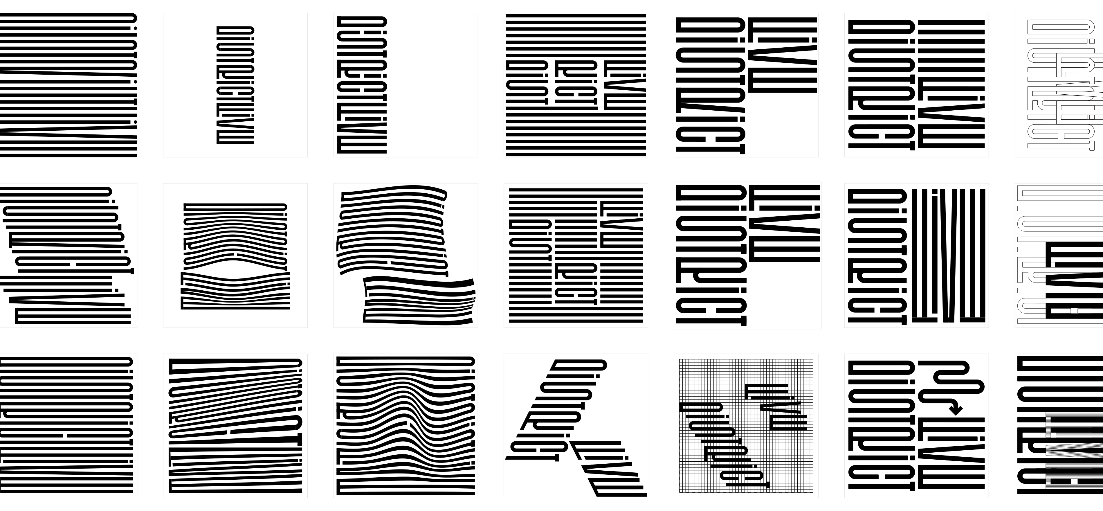
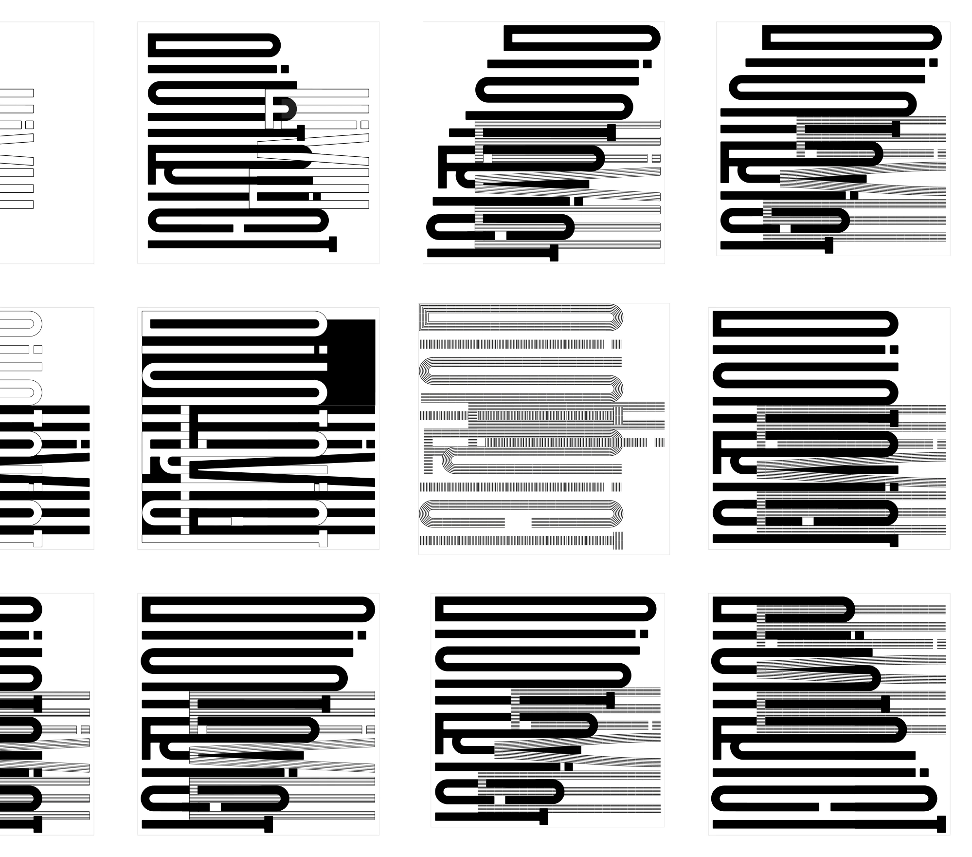
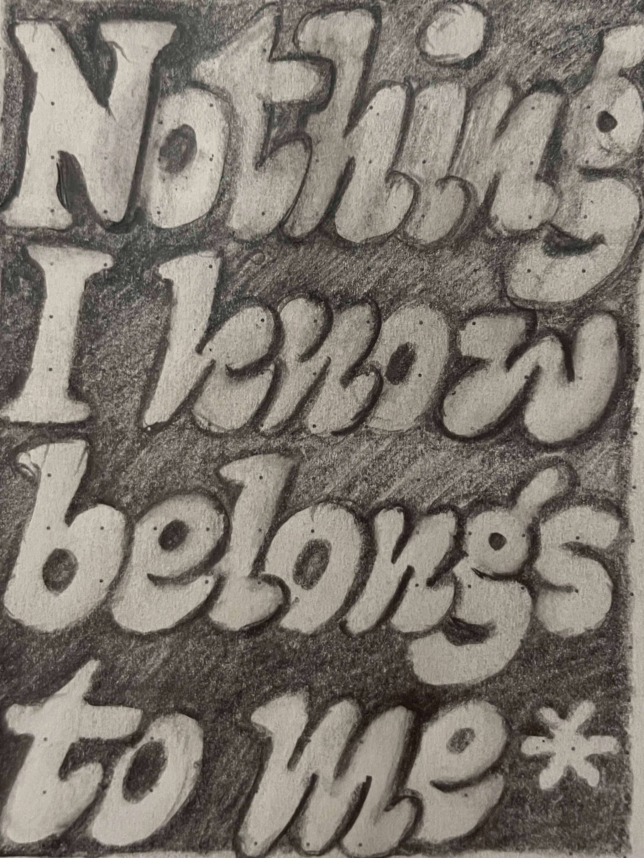
In the graphic design class, there was a competition to design an LP cover for the band District Five. The design had to be purely typographic, with a stronger focus on expressiveness than on legibility.
| Format: | 314,3 mm × 314,3 mm |
| Status: | not realised |